Homepage › Forums › Photo Critique › Street and Documentary › Belfast – Laganside
- This topic is empty.
Belfast – Laganside
-
SteveD
Participantpaperdoll
ParticipantHi Steve – unfortunately I can’t give any technical advice (thought I doubt that you need it!), but I can tell you I love the last shot.
What I love about looking through the photos posted here, are the great ideas you get to try for yourself…..It’s a good way of learning when you are working on a hobby alone!Allinthemind
ParticipantRob
MemberEvery one a winner Steve, as usual, but I have to agree on the last being the pick of the bunch. What a stunning photograph you’ve achieved there. Really well spotted. You have a remarkable eye for the unusual and unexpected.
Regards
Rob.
stuttter
MemberRoberto
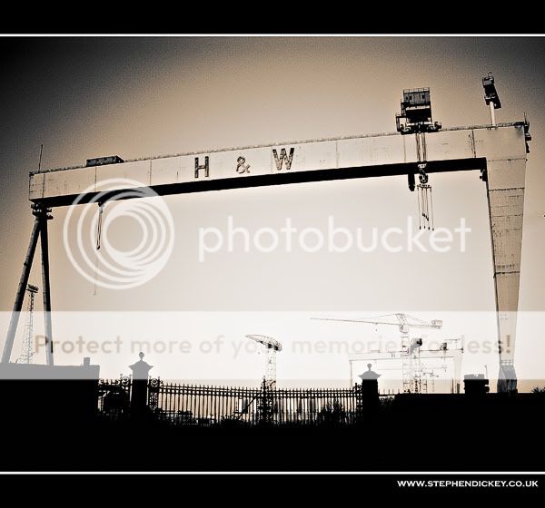
MemberSteve, I like the first photo because the composition.
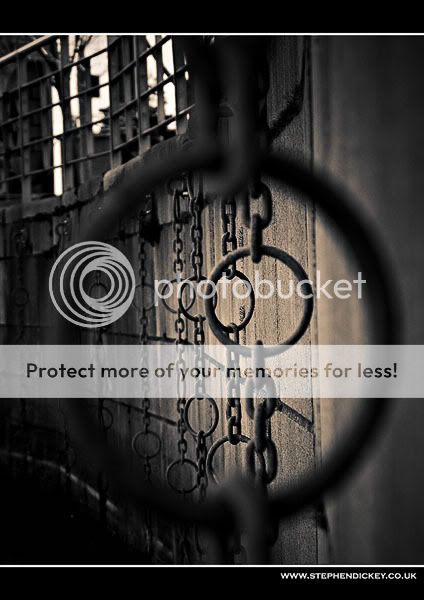
The third photo need more space on the top and less on the bottom, I think.
My favourite is the last shot. I would crop the top part to have only the full first ring in the photo and darken the rest of white spot.Not Pete the bloke
ParticipantGreat stuff Steve – give me a shout some night or day when you want to go out and about. Have to agree that number 4 is the pick of the bunch.
richiehatch
MemberThey are all nice Steve but I really like that last one… super image…! Lovely tones and framing…!
Richie
ciaran
ParticipantWhen I saw a post from you in the street section, I began to lick my lips in anticipation. Unfortunately, as I started to look through the images, I was left with a slight feeling of disappointment. Don’t get me wrong, they’re good shots, but in comparison to some of the images you’ve posted recently, I just didn’t feel these compared. That was until the last shot of the rings!! Very well seen and captured. Terrific image and the toning is very nice.
SteveD
ParticipantThanks to all for the feedback!
Roberto – I like that crop, thanks for the suggestion.
LoGill
ParticipantMark
KeymasterJust noticed these, not sure how I missed them before.
First one is very Holga like and is of course synonymous with Belfast the world over.
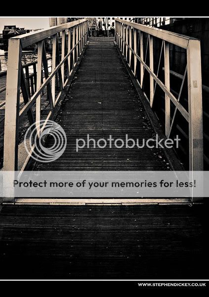
Second one is great, super tones like the other two. I like the composition in general
with the space at the bottom.Third one was well noticed by you. DOF works a treat.
jjml
Participantfstop89564
Participantterry
MemberHi Steve,
Like all your shots but like everyone else N0.3 is the one for me. I also like the crop Roberto did as it brings your eye straight into the rings without any distractions. wish I could be so artistic. Great work.
Terry
You must be logged in to reply to this topic.


