Homepage › Forums › Photo Critique › Street and Documentary › Ha’ Penny Bridge C&C Welocme
- This topic is empty.
Ha’ Penny Bridge C&C Welocme
-
brookied
ParticipantRodcunha
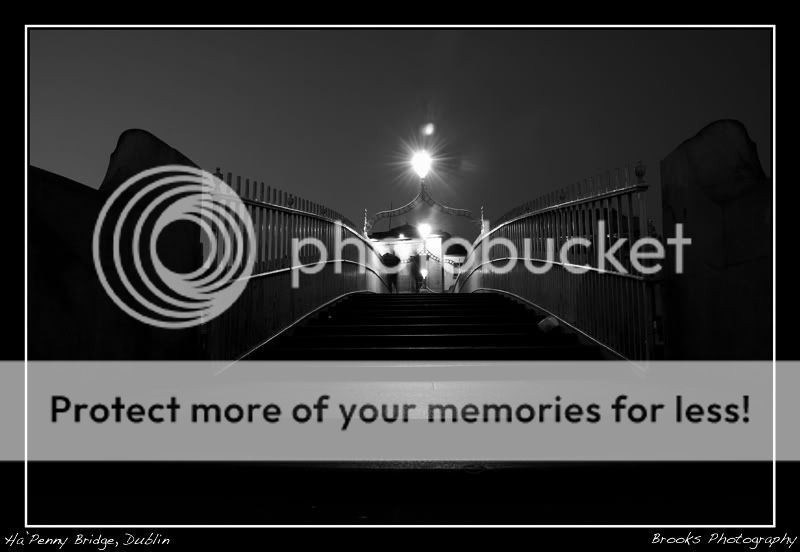
ParticipantI wonder why there are no comments on this shot yet, I love this shot, great low viewpoint, very nice high contrast and the 2 blurred people on the top really add some interest to the shot, the conversion is also very good…
Cheers,
Rod
brookied
Participantno comments either means no people like it or there is no point of interest
Rodcunha
ParticipantNahh, it can mean they are too impressed by it and therefore speechless! ;)
You’ll see you’ll get a few more comments in a couple of hours… all it takes is the first one! :P
DaveP
ParticipantHi Brookied
The image was only posted this morning so I’d give it a while. It is a common thing to post an image and get no comments but I wouldn’t worry about that or think that something is seriously wrong. Just have a look at the number of views on most postings and then look at the replies that the posting received. This I think will improve as the membership grows. On some other forums you can post an image and have replies almost instantly, but most of them are worthless. I have found that the members of this forum however have far better knowledge of photography and the critique is constructive and helpful.
As for your image, I like this view of the bridge rather that the usual Ha’ Penny Bridge stereotype. I like the conversions and the effect you are trying to achieve but the light smack in the centre of the composition is not to my tastes.Nicely taken image.
Dave
ciaran
ParticipantVery unique take on the bridge.. I like it lots.
How do you do your conversions?
brookied
Participantcheers guys, I must say this site would be in my op two photography sites. The comments seem to truly dissect a photography in a very helpful manor.
As for the conversion.
Elements 4.0
I add a gradient map, B&W
I then adjust the levels,
Brightness and contrast
sharpen,
Remove noise
resize
postbrookied
ParticipantNot Pete the bloke
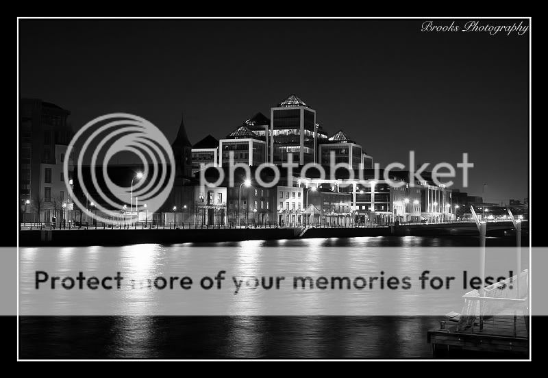
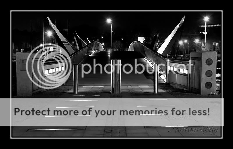
ParticipantVery nice, all of them. I remember Steve D did a colour version similar to the last one.
pete4130
MemberBrookied,
I totally loved the Ha’Penny shot when I saw it earlier today but was in a rush out and didn’t have time to comment on it. It’s a really different viewpoint on a very photographed piece of Dublin and you have shown it in a much different light adhering more to its well know shape and form rather than a more typical perspective (not that more typical shots can’t be very nice too).
I like the fact that an image with alot of dominant black and lacking detail making for a really strong image. Its a step away from what you’d expect to see. This image definitly gets my thumbs up.Sometimes it can take a while for an image to get any comments. Usually when they do come, it’s a flood like you’ve seen on this one.
Pete.
You must be logged in to reply to this topic.


