Homepage › Forums › Photo Critique › Street and Documentary › Dublin
- This topic is empty.
Dublin
-
Roberto
MemberMark
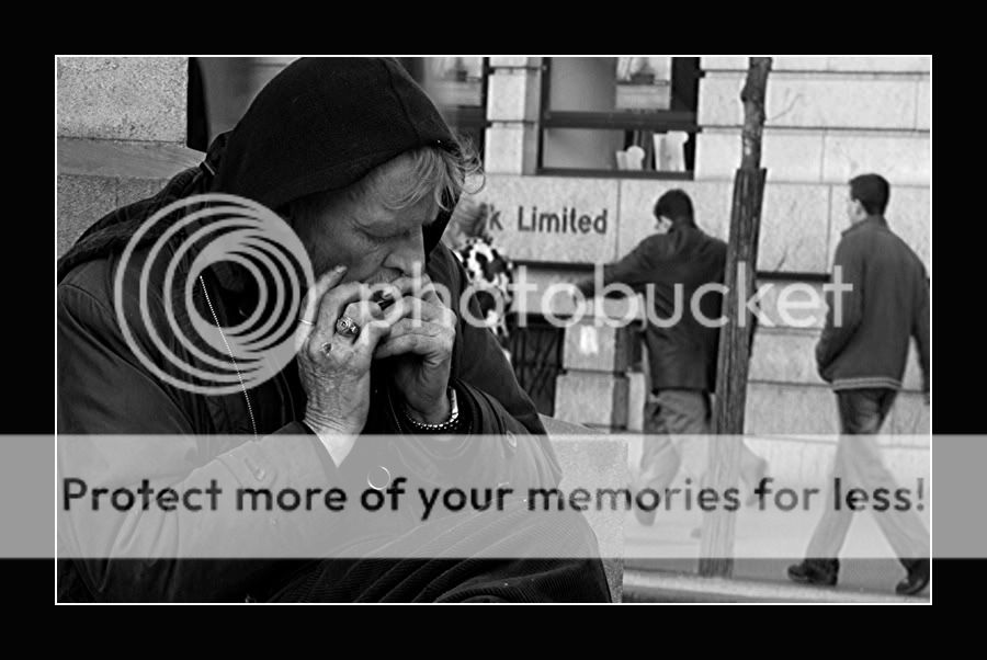
KeymasterLike the conversion Roberto as well as the subject. Clearly a guy on hard times.
Not sure if I’d straighten the verticals on it or not. Its a little bit distracting.
Expresbro
ParticipantThat’s a great portrait Roberto…love the conversion and the the sharpness. Would prefer a shallower DOF dfor my taste..blur the background as i find it a bit distracting from the main subject. A bit of blur would leave the impression of the people rushing by..but not be so intrusive.
It’s nice to see some different style of shots from you lately. Maybe I should try some abstract now… :wink:
Roberto
MemberExpresbro wrote:
….It’s nice to see some different style of shots from you lately. Maybe I should try some abstract now… :wink:
I was waiting for this type of comment :) :lol:
My ‘creative’ :lol: style is on brake now.
I agree with the comments. The photo needs some work.Puckpics
MemberI quite like this, this is an image that would be suited to the Holga treatment. Has promise in my opinion.
Flipflip
ParticipantSwordie
MemberA descriptive creative rationale might be appropriate to go with this image.
I actually like the way we can see what’s in the background.Life is not all black and white, there are lots of greys. Everyone is so concerned with their own world. A big contrast between the character in the foreground and those in the background.The man is concentrating on his music and trying to earn a few bob, as he has not much else left in his life. A bit ironic that he is sitting across the road from a bank with big, solid walls that cannot be broken down. The lads in the background are not concerned with this man’s life – they are just going on with their own business. The fella behind the post is in such a hurry that nobody is going to get in his way. His time is so “Limited” and the musician’s resources are so “Limited”.
GrahamB
ParticipantI really like this one Roberto, a good break from your usual style.
The picture to me raises lots of questions. The chap looks like he’s busking.
His finger nails and clothes suggest he may be homeless but look at this watch and
his rings. I like the position of his head and the fact that his eyes are closed and not
making contact with the photographer. He looks lost in his own world. The people in the background
are blurred enough to suggest movement so I would leave them the way they are.
This shot has great appeal but I do think it will receive mixed reviews.Roberto
MemberThanks Swordie and Graham for the comments.
When I was taking the photos, I was thinking about the ‘life’ around the guy. One thing is pity that the Bank sign is covered by the woman.
I think that she is little bit disturbing because the coat. I am still not sure about the tree if need streighten….
Little blur effect may help….? Have to try and see.brookied
ParticipantA good shot, something a little different with the POV on a street shot. I wonder what this would be like in a high saturation colour shot?
seem the weathering on the persons face would be interesting
You must be logged in to reply to this topic.


