Homepage › Forums › Photo Critique › People › Pure Innocence
- This topic is empty.
Pure Innocence
-
brookied
ParticipantRob
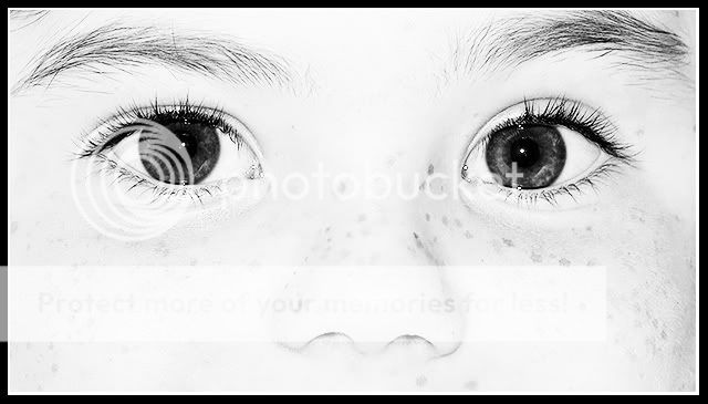
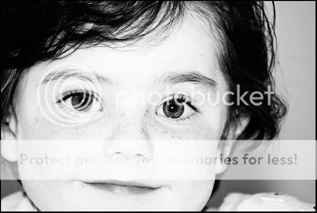
MemberI like the high key approach, though personally I think you’ve cropped too
closely for this to work well, losing that whole fade-to-white effect more
commonly seen. The heavy black frame doesn’t help in this respect
either. Also, high key images tend to work better with a ‘softer’ approach,
whereas this one is so sharp that even the freckles have edges.
I like the idea, but I think it might be worth revisiting the processing…Rob.
brookied
Participantyou think maybe more space top and bottom or more from the sides? what about the whole face? first time with this kind of edit ;-)
PeteTheBloke
MemberI’m a bit put off by the overall flattening of the cheeks and hence the face caused by the processing and, perhaps, the direct flash.
The sharpness also renders some undesirable details highly visible e.g. nostril hair.
This person must have a lovely face – I’m sure seeing more of it would be more attractive.brookied
ParticipantPeteTheBloke
MemberRob
MemberPeteTheBloke wrote:
Much more appealing, though I wish the chin was all there.
Likewise.
Lighting behind might also help make it more high key…Rob.
brookied
Participantshutterbug
ParticipantHi Brookied, I have been experimenting with High Key portraits at the
moment and I had a play around with your picture (hope you dont mind)
I added a bit of selective colour and and skewed and cropped it a bit,
what do you think?
Doesnt take long to do this in ps, very basic manipulation. (has to be if I can do it!)
P.S. looking at it on the screen it could probably do with a tiny border as I have
cut off a bit of the eyebrow and I think the edge needs to be defined a bit.Pixelle
Memberbrookied
Participantshutterbug
ParticipantOops! apologies to your little boy :) easy enough to remove
the lippy……..does he have blue eyes?Allinthemind
Participant
You must be logged in to reply to this topic.


