Homepage › Forums › Photo Critique › Sports › Golfers
- This topic is empty.
Golfers
-
Roberto
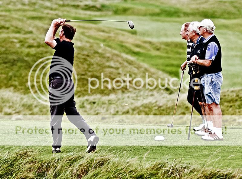
MemberI was first time in my life on golf course and first time I took photos of golfers in Lahinch.
Didn’t have luck to catch a ball…………
C&C welcome.
Sodafarl
MemberRoberto
I like the first one the look on the other golfers faces says it all 0nly thing is are the pictures in the wrong order. Looks like he has drove off in the first and is getting the swing statred in the last.
SodaRoberto
MemberNot Pete the bloke
ParticipantRoberto
MemberI did contrast, highlight and midtones adjustments.
The original photos are not bright enough.lahinch_lass
ParticipantI’m not sure how those pictures are looking on others peoples systems but on mine they look de-saturated.
I can sympathise with the light not cooperating, but there is definitely some juggling to be done when trying to compensate for that. In this case the pictures look to have been lightened too much without any saturation added.Rob
MemberActually I quite like the processing Roberto, reminiscent of old
faded prints that have been left in the light for too long.
Nicely composed too, though as previously mentioned, the order
is reversed…
Nice work.Rob.
Roberto
MemberThanks guys for the comments.
I like the photo as the sht but not happy (yet) with the processing.
I would be happy if these will look like the ‘Golfer’
https://www.photographyireland.net/viewtopic.php?t=9516kram9142
ParticipantThe guy isnt finishing his swing completely. I was say the ball was drawn to the right, hehehehe.
No Seriously, Roberto, like Rob I like the shots too, I actually think that they might look great in B&W.
but definitley there is a bit too much processing being applied, but I guess you have to compensate for the poor light as you said.
Cheers,
Max
rm
MemberC&C Welcome
Nice high action, front foots a little open, left hands a little strong, could get a bit more hip rotation, right leg looks a little closed, may be able to get a bit more out of the club by teeing it higher and even further forward in his stance. Wouldn;t be supprised if he’s fighting a slice (and making it worse)
Definitley there is a bit too much processing being applied
There’s a certain aura about him that’s for sure.
markcapilitan
Participantif you ever shoot a competition, don’t start shooting during their swing…you’ll get told off big time!!!!
S-Man
MemberIts a nice series of shots that are prossesed very well.
Love the expressions on the old mens faces.
:lol: Great work :DUnal
MemberI think they are great shots Roberto. First shot also would make 2 different composition. #1 Player and #2 rest of the lads:)
Unal
lahinch_lass
ParticipantRoberto wrote:
Thanks guys for the comments.
I like the photo as the sht but not happy (yet) with the processing.
I would be happy if these will look like the ‘Golfer’
https://www.photographyireland.net/viewtopic.php?t=9516That one looks more like a painting than a photograph, which is definitely a nice effect… and that sort of ‘look’ has a definite market.
On the issue of processing pictures taken in lousy light I took pictures from the top tier at the HEC final in 2006 so the light was fairly dire, but one of those pictures when printed up had at least half the people who saw it convinced it was a picture of a painting :lol:
Roberto
MemberThanks guys for the comments!
I converted it to b&w but still not happy…. :twisted:
You must be logged in to reply to this topic.


