Homepage › Forums › Photo Critique › Street and Documentary › Funfair
- This topic is empty.
Funfair
-
resistor
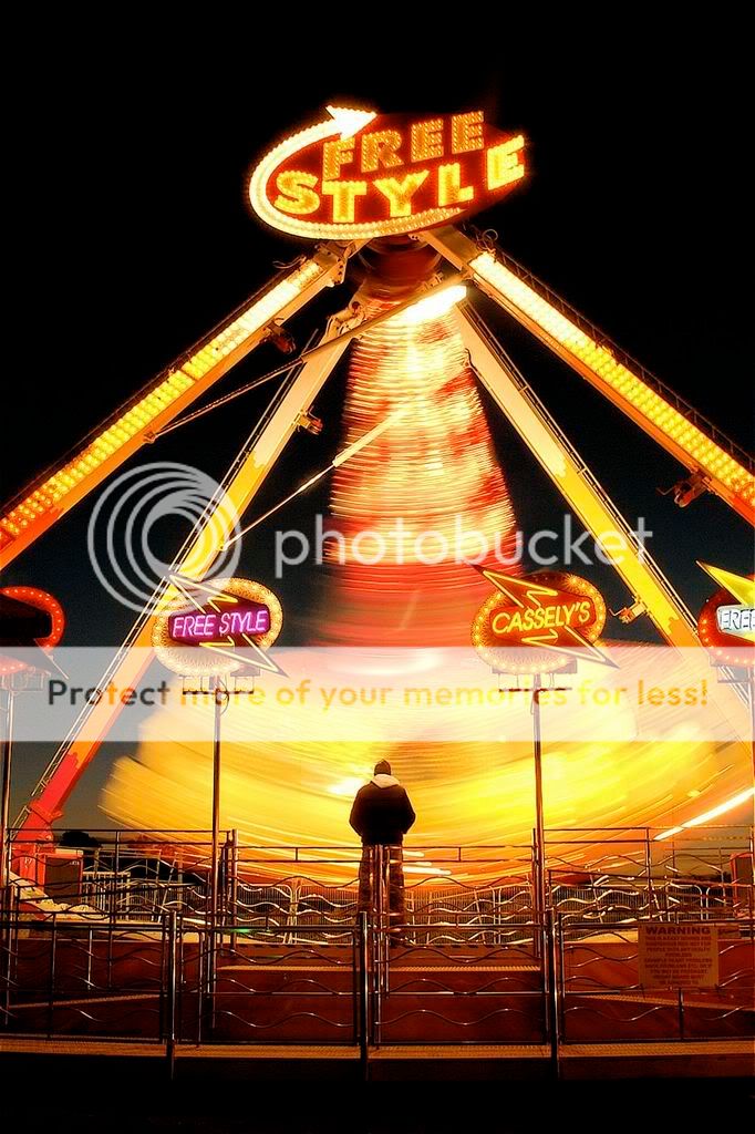
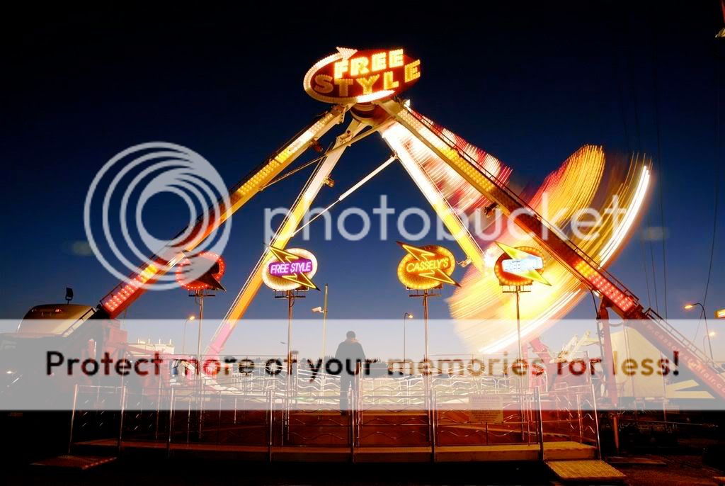
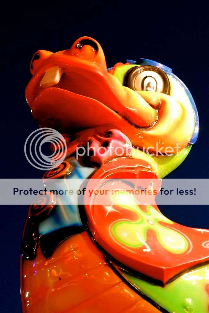
MemberHi… and thanks for all of the ‘welcomes’ that I received a few weeks ago. I spent the last 3 weeks learning how to minimize an image to less than 7k (Avatar image) but now it won’t upload! So, I’ve moved on… I took these last night at a funfair off the Swords Road. I am just hoping that I’ve managed to upload and link these correctly. This is my first posting for a roasting… but please, feel free to comment and to give me hints as to how I might get rid off all that messy light… thanks.
jb7
ParticipantGlad you made it-
Number 3 an absolute stand-out image for me-
That man doesn’t seem to exude any fun at all-
like many of the louche funfair types-The next one is good too, (might benefit from a few different crops?)
though all of them suffer the same fate when put beside number three-Hope to see more soon-
j
ps not sure these could be construed as landscapes-
certainly not as a set-Gfox
ParticipantWow some really nice shots there. Love the long exposure on 3 & 4. The figure standing in front adds something extra. U placed him there?
RavenAsh
Member#3 for me.
Vibrant colours, sharp and the man watching on makes it all come together.
Well done. :)beef
ParticipantHi Resistor!
I didn’t meet you on your way in so I’ll welcome you now… ;)I’ll be honest and say the first 2 and last 2 don’t do a whole lot for me I’m afraid – but that’s just my opinion! Numbers 3 + 4 are a different story altogether. Number 3 is a cracking shot. Number 4 might need a teeny bit of tidying up (clone the bit of lens flare, a tighter crop?) but it’s still a smashing shot.
fair play, keep em coming!
beefresistor
MemberWow, thats a load of very fair critiquing so far ( a bit of a releif!).. No. 3 it is… thanks!
Beef: I’ll boot up my CS2 and learn a bit about ‘cloning’. As for the lense flare, any hints on how to avoid it in furure?
Gfox: nope, he just stands there waiting for.. people to capture him perhaps? You’re right, it would be a different image without him.
GB7: Yes, perhaps 3 & 4 should be in ‘documentary’ (and the others moved back into my external hard drive!). Can a ‘post’ be moved?… I’ll get the knife to No.4
Cheers
:D
PeteTheBloke
MemberI nearly pressed my back button when I realised how many pics I’d have to wait for.
I’m glad I didn’t because no. 3 is a real belter. No. 4 has style, but it’s totally overshadowed
by its companion. The other 4 shots don’t grab me at all, but I can imagine revisiting the thread just
to keep looking at the third photo. Brilliant.randomway
MemberSeeing the first image I knew, there will be some candy for the eyes… I’d totally agree that No. 3. is involving… No. 4 is good, the others are not really interesting, even if the colours are nice. Thanks for sharing them!
Mark
KeymasterPost has been moved :)
I agree with everyone, the movement is superb in those middle photos.
mgst
ParticipantGreat shots no 3 & 4 give agreat sense of movement with lovely colours.
Mick
Rob
MemberRemarkable image number three. I think I can safely say we’re all
glad you’ve gotten the hang of resizing for posting here.
Nothing awful here, but I can’t help feeling sorry for the other images
having to take their place alongside such a cracker as number three.
Really well done with it…Rob.
resistor
Memberthanks for the positive comments Rob… is there any way to remove the images that I put up as a deliberate weak comparison to ‘NUMBER 3’ ?!! Or are they there forever??
Just curious, do they display the same on my monitor as on everyone elses, cos if so, they may still be a bit large, no?From the comments so far, I’m afraid I’ve peaked already!! Scared to upload any of my other earlier images now… so I’m off to the Adobe Training Arena!!!
m.
jb7
ParticipantJust call all your pictures Number 3-
seems to work so far-They are a little large-
people on a slow connection might curse you and move on-I think its always worth posting less images in a thread-
conversations are more focussed,
and some people who might pass comment on one image
might not be arsed to have to refer to them all-You can edit your posts,
but its better not to delete pictures that have already been commented on-
some of us are confused enough already,
and it wouldn’t take much of a push to tip us over the edge…If you need to edit a picture,
its best to post a new one-
the chronology of the thread remains intact-I can’t believe you’ve peaked already anyway-
As a new member- long time listener/first time caller-
are you surprised by the reaction,
or was it just what you were expecting?j
Mark
KeymasterYep, best to leave them in the post. In future only post 2-3, that way you’ll get a comment on each ;)
You must be logged in to reply to this topic.


