Homepage › Forums › Photo Critique › Catch All › Selskar Abbey-Wexford
- This topic is empty.
Selskar Abbey-Wexford
-
lousy
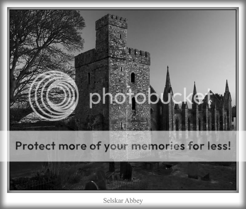
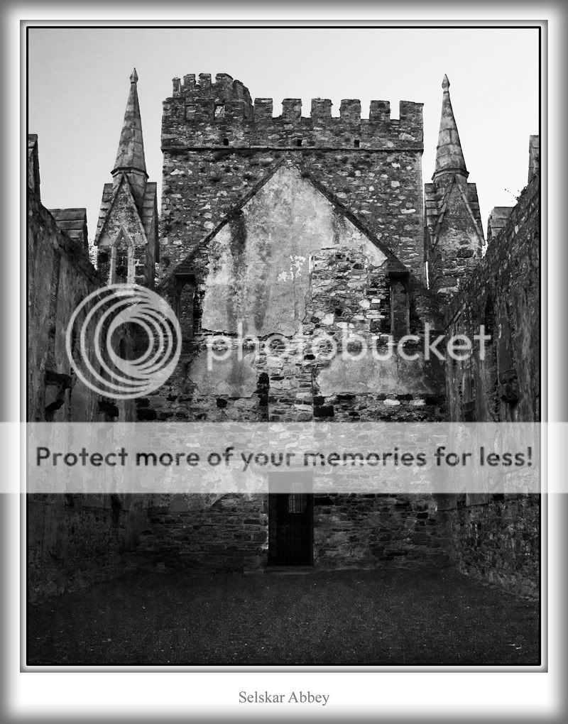
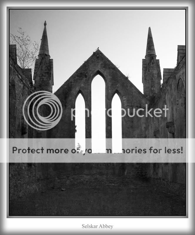
ParticipantThese are three shots of Selskar Abbey in Wexford and a conversion-
I’d appreciate constructive c&c
Pat
#2
#3
nfl-fan
ParticipantPic #1 is a class image, excellent conversion and dare I say 100 times better than that colour Selskar shot your took a while back.
Pic #2 has some great detail in the old stone work.
Do you do these in RAW?
lousy
ParticipantWould you believe…. I don’t shoot jpeg at all now, I have it set for raw only-
Getting the hang of it now.-
#3 would be the weakest-nfl-fan
ParticipantI don’t shoot jpeg at all now, I have it set for raw only
What can I say other than ‘I told you so’… and I mean that in the best possible manner. You pics have gone up at least 2-3 marks outta ten since the changeover.
Big Fella
Participantirishshagua
Participantpic 3 is only weak because the sky is so bright in the windows and kind of distracting IMO. Number one is a great shot and two is very good as well except the sky is a tiny bit bright in the top right hand corner.
Only nit-picky complaints but you keep hurning out good pics so I have to start nit picking :lol:
Very nice set. Really like the first one though. Maybe if the ruins had been positioned slightly further to the left as my eye is being led away from the main picture the way it is but that is a very minor complaint.
lousy
ParticipantThanks John, Stephen and Brian-
I used a cir polariser on the 3 shots and the conversion probably worked against me, but I was reasonably happy with them.Pat
wexkel11
MemberHi Pat,
Three good conversions, two is my favourite good detail in the stonework. If one & three were a little brighter it would bring out the detail. Only my opinion. Good work. Mikelousy
ParticipantRob
MemberLove your viewpoint in number one, though I reckon it could tolerate
a slight sharpening. Two, on the other hand, could do with perhaps a little
less sharpening. Nice work Pat…Rob.
lousy
ParticipantSetantaB
ParticipantNumber 1 is the one for me in my ever so humble opinion.
Under the trade description act I agree with one of the previous posts – you can’t call yourself as Lousyphoto any more…
One simple question though – I really like the border too – great dimensional feeling- is that PS or some additional tool?
Alan
You must be logged in to reply to this topic.


