Homepage › Forums › Photo Critique › Landscape › Isolation reworked
- This topic is empty.
Isolation reworked
-
Alan Rossiter
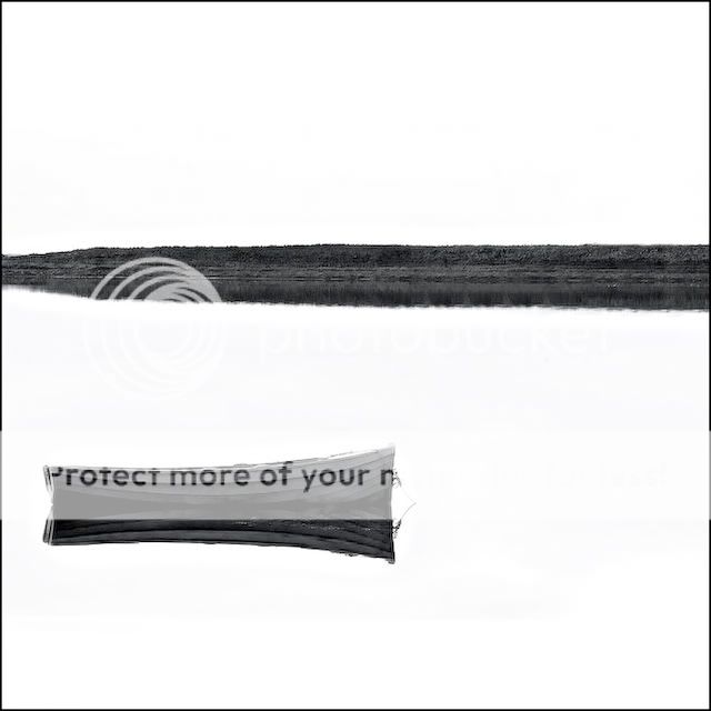
ParticipantI had this image on PI before in a duotone effect. I was looking through the back catalogue and I remembered that I wanted to rework this one. So I did.
Alan
Rob
MemberOdd how the same picture can look so completely different given
another treatment. I have to say I’m not entirely sure about it now.
I like the simplicity, but perhaps it’s not simple enough; with so
much white, the tree silhouette is actually more noticeable than the
boat now and has become the strongest point of the diagonal in your
composition. Just a thought; how about losing the tree altogether and
going for a Luda-esque square crop?Rob.
frozendins
ParticipantI haven’t seen the original as I am only a newbie but I tend to agree a bit with Rob. The tree and the boat drag the eye about, it feels a touch disjointed. However, I’ld like to see it without the boat, just the tree maybe?
lovely working of the image though.
irishshagua
ParticipantVery nice pp work on this. I think because the sky is so white in this now, you could afford to crop it down a tiny bit. Just to get a bit tighter on the main draw of the image. I think if the boat had’ve been a tiny bit higher in the frame then it would have been perfect for a great crop. Intersting effect though.
Brickee
Participantpetercox
MemberAlan –
I have to agree with Rob on the square crop. I was thinking about a panoramic and using either the boat or the tree, but the square works much better. I have a version of it if you’d like me to post it. It requires a little cloning so the shore doesn’t taper off to the left (looks unbalanced). But it looks stunning.Peter
Alan Rossiter
Participantnfl-fan
ParticipantBeing tricking around with HDR again… NOT!!!
Well I have to say Alan fair play to you for broadening your horizons.. you’ve gone from one end of the spectrum to the other that’s for sure.
As for the shot… I could see this hanging on the wall in a very contemporary styled house. Minimalistic by a mile. I think it might look good with the top and bottom fifths cropped.
Brian_C
ParticipantAllan I think it’s class. I cropped off a little off the foreground, just by scrolling down, and it look really good. I think it could look really good as part of a nice B&W set of three.
I think it could fit in well with Andy’s lost art of LDR photography.PeteMcD
MemberI like what you’re going for here! I like the simplicity (obviously its my kind of thing). And I love the bright sky and water.
I’m not sure whether you did selective adjustments on the sky and water, however some of the edges seems a bit jaggy. Easily fixed though.
Composition wise, it could be simpler again. As a few have mentioned. There are a few options. The square crop as mentioned. If you are not opposed to heavy manipulation (I don’t think so, given some of your recent HDR stuff…), you could clone out the tree, and its reflection. Then extend the canvas down at the bottom and move the boat down a little. Maybe crop some off the top. However, you start doing this, and its easy to get lazy with composition when you have the camera in your hands!
Very nice though. My kind of stuff.
petercox
MemberPeteMcD
MemberI have just been working on this one too. Its actually quite similar to what peter has done. Wanna see it as well?
Alan Rossiter
ParticipantOh, go on then! In for a penny…
To be honest Peter C it’s not one that I’d immediately do myself but horizons, as well as level, need to be broadened. A square crop with this positioning seems odd but interesting. Yeah, it better imitates the isolation title than the original which is probably too conventional of a setting.
Lets see what Peter M has to offer.
Alan.
nfl-fan
ParticipantU need to win the Photoshop Challenge.. then submit this for the next round and we’ll all give it a whack!
PeteMcD
MemberHere ya go!
I cloned out the tree and moved the boat a little. Also sneaked in with a little levels and clarity/high radius unsharp mask to boost the local contrast. Just throwing some ideas out there!
You could play around with the crop for ages on this one. On thirds, a little off, more space top, more bottom…. its personal pref after a while.
I’ve probably done this too big again. Is 640px too long for your screen?
You must be logged in to reply to this topic.


