Homepage › Forums › Photo Critique › Architecture / Urban Landscapes / Streetscapes › no title….
- This topic is empty.
no title….
-
Roberto
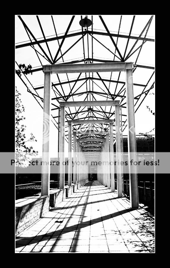
MemberIt is from the English garden in Munich…
I just like the simple construction…..
Any comments are welcome.Vanessa kennedy
MemberOverall I like this Roberto. Love the structure and perspective throughout… Would be even nicer though if the sun light wasn’t so strong… :)
Cota
ParticipantI actually like the sharp sun shine; it works with the strong steel structure.
Rob
MemberVery graphical Roberto. I quite like it, good conversion and
lots of interesting geometry. Would it be worth correcting all those
verticals and horizontals I wonder…Rob.
Roberto
MemberThanks for the comments!
Actually it is not strong sun light but me….. I played with highlights and contrast but not as usual….. :DRob, you are right! It would give more effect if the verticals and horizontals are right…. I will come back to this sometime in the raining days….
maybe don’t have to wait long…… ? :lol:jessthespringer
ParticipantI like this Roberto.. Very contrasty and the verticals give it a unsettling
feel. I don’t think it would be half as interesting with straight lines and loads
of detail.Sinead.
BM
ParticipantHad a quick go at some of the verticals and horizontals (only because I’ve recently learnt how to). After a while, this would do your head in!!
I still prefer the original!
Roberto
Membergood work BM.
both are ok for me…. would be better, if the background is empty… :-)
You must be logged in to reply to this topic.


