Homepage › Forums › Photo Critique › Catch All › Fashion › Prodrift Clothing
- This topic is empty.
Prodrift Clothing
-
paddymcgrath
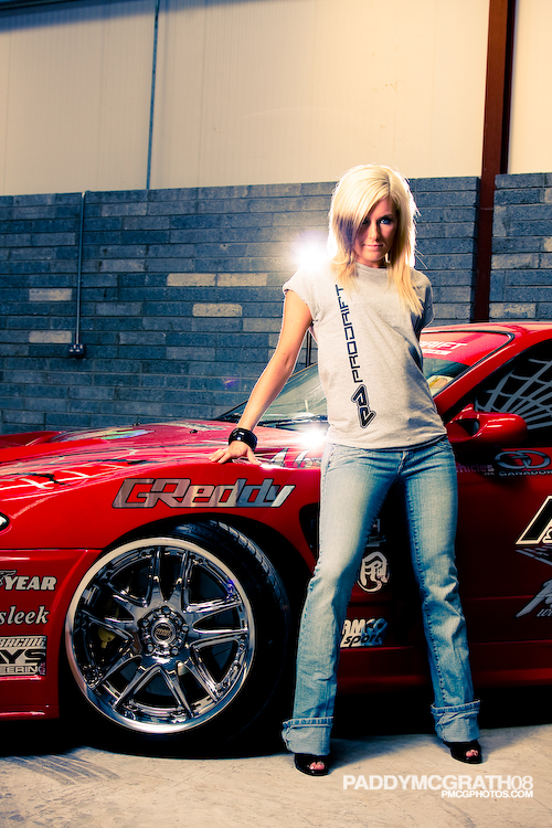
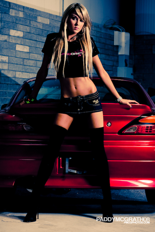
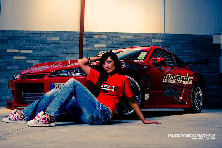
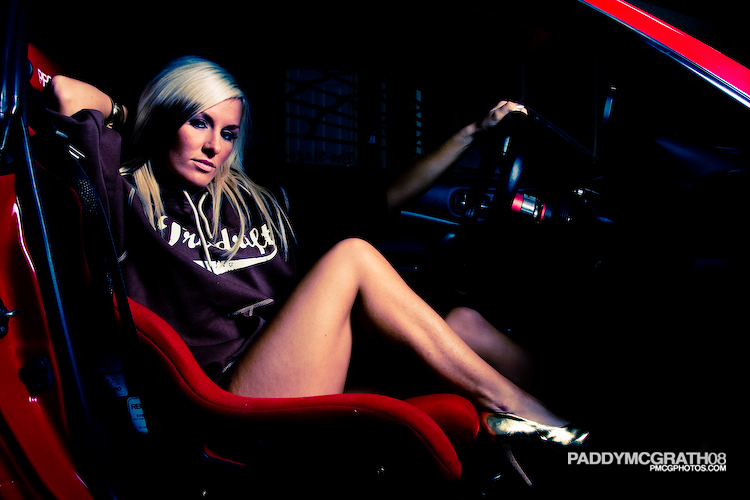
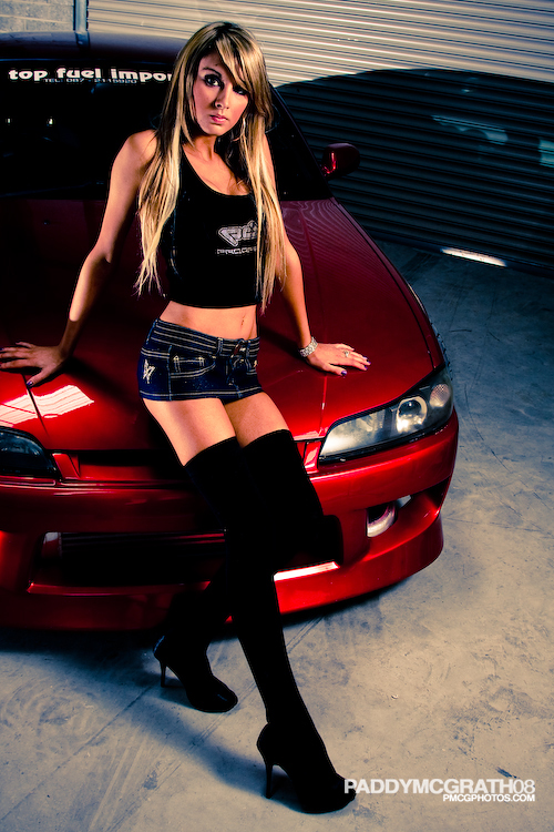
ParticipantThis was my first ever semi-proper fashion shoot, so I’ll let you guys be the judges.
The brief was to tie in the clothing range with the Prodrift Series brand, to come out with shots that can be used for adverts or online to display the clothing. I think the post work might be a bit too strong, been looking at it for too long so might come back again in a week with fresh eyes and get some fine tuning done.
Shoot details:
Canon EOS 40D w/ 24-105F4 L IS
Canon 580EX & Nikon SB800 with shoot through brollies.
Canon 430EX shot bare for some fill in certain shots.
Big warehouse & Expensive cars that spoke Japanese when I tried to start one to turn the wheel.Anyways, all feedback welcome :)
1.
2.
3.
4.
5.
More can be found on My FlickR
Clseeper
ParticipantI like the first and second ones especially. the blow outs in the first may be a tad too strong but it does catch your attention.
Overall I think they look very good. I think the clothes are lost in some of the later ones though but I suppose your brief was to link rather than show off the clothes.
Good set.
badphotos
ParticipantI for one love your post work everytime!! Love number 1 and 2 as well but think they are all great. What was done, a bit of cross processing and levels or was there more extensive work done? Just noticed on number 4, don’t really like the way her left arm is, doesn’t really look attached to her, anyway these are great as always. Best of luck!
Allinthemind
ParticipantI like the compositions, the expressions on the faces are a bit “bored”.
Si
orozco
ParticipantI like shot #1 but I dont like the models outfit… the jeans cuffed are too sloppy looking. I know its hard on a shoot to pay attention to every minor detail… good assistances are worth every penny!
#2 I like this one and the model looks good.
# 3 the model isnt working on this shot.
#4 the had shadow is not complementing her leg and you lose part of her arm as well.
#5 Looks good! but you maybe want to watch out for those reflections on the car.
MTBIreland
ParticipantSurprised there are no more comments on these….. great shots Paddy… everyone one of them…
mylesrants
Participantthe lighting on the models is spot on . top marks. great contrasts
the overall seems a bit dark and the messy backgrounds take my eye of the target. such a fine looking target.
keep it up lad
Mark
Keymasterkombizz
Participantmervifwdc
ParticipantNice work paddy!
I wonder what a smoke machine with a flash backlighting the smoke would add to the background – not that you’d be spinning tyres inside, but in a multistory car park…….
Merv.
MDCPhotography
Participant
You must be logged in to reply to this topic.


