Homepage › Forums › Photo Critique › Street and Documentary › Dragan-Stlye Portrait of Homeless Man, Dublin.
- This topic is empty.
Dragan-Stlye Portrait of Homeless Man, Dublin.
-
Expo 2000
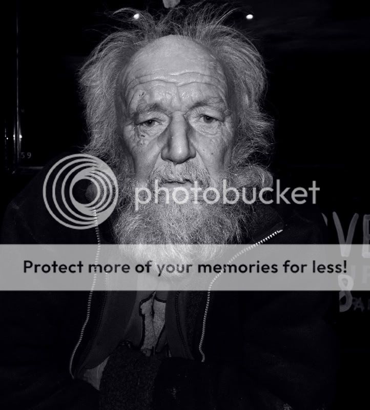
ParticipantHi, I took this shot on O’Connell St in Dublin a while ago. It was late at night and of course I asked permission and he oblidged. The lines of his face inspired me to try processing this shot similar to the proccess that Andrzej Dragan would use. It’s my first attempt but I feel it aint too bad. I’ll try with some more shots today.
Thanks for taking a look and if you care for some C & C be my guest! :)
ben4130
ParticipantHows it goin mick, long time no see.
Great portrait, although his aged face is screamin black and white, maybe try a conversion.
Benscotty38886
MemberExpo 2000
ParticipantAlright Ben, How’s it going man?! Thanks for the comments lads.
Yeah, I thought black and white too but I was unsure. I’ll post a black & white version up in a few mins.
Edit: Here, is it any better? I did it B&W with 3% blue saturation.
ben4130
Participantjb7
ParticipantI’ve heard of this Dragan thing-
is it a style of photography as well as a style of processing?For some reason, the title brings to mind the story of the street kids playing football in Marseille in the seventies-
“I’m Pele” says one kid, passing to another,
who runs with it, saying “I’m Georgie Best”
before laying it off to another, who sticks out his chest, and says “I am Cantona…”Sorry, rambling…
This is more of a portrait than something that would fit within the street genre-
posed, direct, not something grabbed on the fly, something made out of nothing-As a portrait, it’s over-processed-
the colour is over-done, and not very respectful to your sitter,
who seems to have been made into a caricature-
unless he actually is that colour-As a portrait, the interesting thing is his face-
the little scraps of background don’t really add anything meaningful,
except for implying exterior, night…
Or, interior, flash- I don’t know-The distance suggests an unwillingness to get up close,
although that’s only my opinion-
and the homeless thing-
is the picture telling me anything about his address,
and is that the point of the portrait?If it is, I don’t think it works-
it doesn’t really tell me about his condition,
other than that he’s perhaps to be seen as an easy target in a public place-I think a less extreme, or cartoonish, processing might make this into a better picture-
as would getting closer-
and getting the flash off the camera-joseph
eshortie
ParticipantI’m with J here, I’m not a huge portrait person but I think the processing is way over done,
the skin tones are unnatural and the flash hasn’t helped
The mono version is much better, darken it a little and I think it could look nice.Expo 2000
Participantjb7 wrote:
This is more of a portrait than something that would fit within the street genre-
posed, direct, not something grabbed on the fly, something made out of nothing-I suppose your right. I guess I posted it as it was a stranger on the street.
As a portrait, it’s over-processed-
the colour is over-done, and not very respectful to your sitter,
who seems to have been made into a caricature-
unless he actually is that colour-I’d say it’s a bit of both. There’s about 3 layers mergeg here abs naybe I didn’t compinsate for the extra saturation it has given. Although, he was red faced from what I believe is his addiction to alchohol.
As a portrait, the interesting thing is his face-
the little scraps of background don’t really add anything meaningful,
except for implying exterior, night…
Or, interior, flash- I don’t know-Exterior flash
The distance suggests an unwillingness to get up close,
although that’s only my opinion-
and the homeless thing-
is the picture telling me anything about his address,
and is that the point of the portrait?A famous photographer said something like; If your photo isn’t good enough – you’re not close enough! Maybe this rings true here, but I tried. I saw him as I arrived out of the pub. He looked lonely, sad, drunk and withered from the life he’s living. I wanted to capture that.
If it is, I don’t think it works-
it doesn’t really tell me about his condition,
other than that he’s perhaps to be seen as an easy target in a public place-In college, we just touched on documentary style photography. Some photos inividually make no sense until you read the story behind it. Maybe I should of got some info from him. I’ll bare that in mind next time.
I think a less extreme, or cartoonish, processing might make this into a better picture-
as would getting closer- and getting the flash off the cameraMy first time processing in this way. I’m gonna try again. With all things new that I’m learning it’s easy to go a little overboard with it.
Thanks for your feedback and good, constructive criticism. I’t a big help :)
and getting the flash off the camera-gibster
ParticipantI’m going to go a little against the flow here and state a preference for the colour shot. I agree that I think the processing has gone too far, and am not familiar with the style of picture you were looking to emulate, so dont know if that is intentional. I think the story lies in his eyes and these stand out more in colour. A closer crop would remove some of the distractions at the side that add little and make for a very strong portrait I think.
rc53
MemberDarken the b/w around the face, and either crop more tightly, or clone out the brighter bits to left and right.
You must be logged in to reply to this topic.


