Homepage › Forums › General Photography › Digital Photography › Which is tonemapped?
- This topic is empty.
Which is tonemapped?
-
SteveD
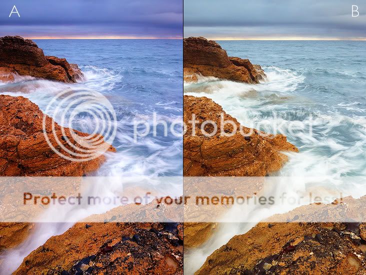
ParticipantHi folks, just a little experiment to see how effective tonemapping with Photomatix actually is when compared with a standard workflow.
Thanks for the feedback.
Martin
ParticipantNo idea which is toned mapped. I think B is the better one as the colours look more near natural though.
Just an observation. Do the colours in both look a bit over done?
I think to be honest Steve you tend to push the colours to much in somw of your shots.
jb7
Participantfourth option for me-
though it’s a bit of a lottery, to reiterate what Martin said…j
Ramona
MemberFourth option for me also. The darker colours seem to draw your eyes to them more, so it appears the stronger picture.
And after tossing a coin, I voted for B to be tonemapped. Really hard to tell as they both don’t really look that natural… Great pic though, love the ‘moving’ water!SteveD
ParticipantMartin wrote:
Just an observation. Do the colours in both look a bit over done?
I think to be honest Steve you tend to push the colours to much in somw of your shots.
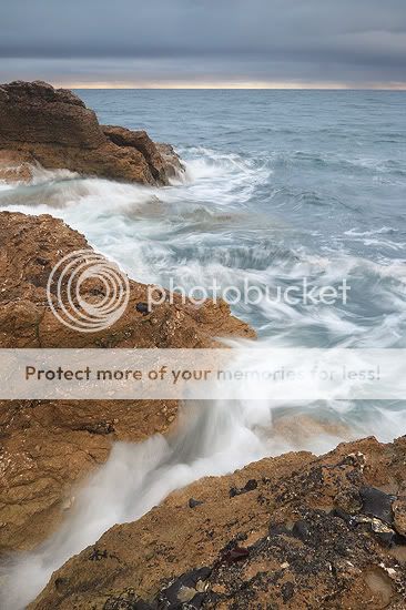
Version C, for those who don’t enjoy highly saturated images :)
This is a straight conversion with Canon DPP, saturation set to default levels! Thinking back to the day of the shoot, the colours in B are not too far away from reality!
Mark
KeymasterMartin
ParticipantVersion C is the best with a little added saturation and a small S shaped curve.
Not even Fuji Chrome Velvia would reproduce colours like in A+B. Anything beyond Velvia in saturation terms is OTT in my book
Just trying to be honest Steve and hopefully help…
M
SteveD
ParticipantMartin wrote:
Not even Fuji Chrome Velvia would reproduce colours like in A+B. Anything beyond Velvia in saturation terms is OTT in my book
Hmm not sure I would agree with you on B. But thanks for the feedback :) .
BM
ParticipantMartin wrote:
Version C is the best with a little added saturation and a small S shaped curve.
Not even Fuji Chrome Velvia would reproduce colours like in A+B. Anything beyond Velvia in saturation terms is OTT in my book
I think Martin has a point here. However, more non-photographers would probably purchase A over B or C.
(I feel a 5-pie question coming on here – fighting to hold it back!)
stasber
MemberI’m saying that B is tonemapped as there is more subtle detail in the sky and more shadow detail in the rocks, esp when comparing the topmost one. Personally, I prefer B as a picture so think it is stronger than A (or C for that matter).
slang61
ParticipantI would definitely choose A as i prefer deep colours. Not sur eif that would make me a “non photographer” its a preference thing and thats what i would prefer.
AndyL
ParticipantI’d say A is tonemapped due to the greater detail in the whitewater, but I’d back off the saturation a touch. I’m not sure the image needs the HDR treatment in the first place. The sky doesn’t seem to have any direct bright light, with just the horizon maybe causing trouble. I’d like to see A with the saturation turned down a touch, or b with the blacks brought out a little more and the highlights recovered.
As they sit, A is the most striking image for me, C a little underwhelming, and B just a little bright.
randomway
MemberI am really not sure, but I think I can see the halo over the rocks on the top in picture B.. the colours don’t look natural in either 3, I think it’s a white balance thing or my colour blindness.
SteveD
ParticipantBM wrote:
Martin wrote:
Version C is the best with a little added saturation and a small S shaped curve.
Not even Fuji Chrome Velvia would reproduce colours like in A+B. Anything beyond Velvia in saturation terms is OTT in my book
I think Martin has a point here. However, more non-photographers would probably purchase A over B or C.
(I feel a 5-pie question coming on here – fighting to hold it back!)
At the end of the day, if someone’s images are generally heavily saturated (and this is not directed at anyone in particular!), then so what!? That is their preference, and if it is clear it is being used ‘creatively,’ rather than being some sort of lack of technical understanding, then surely it is valid?
Moving onto your point BM, about the non-photographers, it might have to go down as the most random statement of 2008 on the forum (IMO!) :D. If the implication is that more photographers would avoid a highly saturated image, I think that is nonsense.
However, I would love to hear the 5-pie question!
stasber wrote:
I’m saying that B is tonemapped as there is more subtle detail in the sky and more shadow detail in the rocks, esp when comparing the topmost one. Personally, I prefer B as a picture so think it is stronger than A (or C for that matter).
Incorrect I’m afraid! A was tonemapped, and it has held onto more highlight detail in the waves. I was just curious to see if the extra effort was worth it, and if retaining said detail was actually noticeable.
slang61 wrote:
I would definitely choose A as i prefer deep colours. Not sur eif that would make me a “non photographer” its a preference thing and thats what i would prefer.
It definitely does not make you a ‘non-photographer!’
AndyL wrote:
I’d say A is tonemapped due to the greater detail in the whitewater, but I’d back off the saturation a touch. I’m not sure the image needs the HDR treatment in the first place. The sky doesn’t seem to have any direct bright light, with just the horizon maybe causing trouble. I’d like to see A with the saturation turned down a touch, or b with the blacks brought out a little more and the highlights recovered.
As they sit, A is the most striking image for me, C a little underwhelming, and B just a little bright.
You got it, but who said anything about HDR? Tonemapping and HDR are not the same thing! Thanks for the feedback.
randomway wrote:
I am really not sure, but I think I can see the halo over the rocks on the top in picture B.. the colours don’t look natural in either 3, I think it’s a white balance thing or my colour blindness.
I think that halo is probably due to a little over-sharpening for web. As for the colours (or maybe you mean saturation levels?), I’m not sure how you can say that with authority if you have not been to the location. As I said, B is closest to reality. For comparison, here is one of BrianC’s shots from the same location – note the colour of the rocks! http://www.pbase.com/curran/image/86765732
nfl-fan
Participantmight have to go down as the most random statement of 2008 on the forum (IMO!)
There’s a lot of statements on this forum… I’m just wondering have you read them all?
:D
You must be logged in to reply to this topic.


