Homepage › Forums › Photo Critique › Landscape › Fanad lighthouse. Edited……..new version
- This topic is empty.
Fanad lighthouse. Edited……..new version
-
sean1098
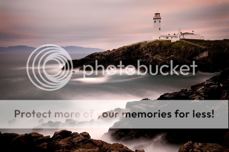
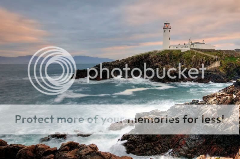
MemberOne of my favourites from today.
We did not have much luck with the day weather wise, but we will be back very soon,
Which do you prefer?
Sean.
fig
ParticipantVery subtle tones are very nice and the sea looks class. Personally I would like to see more detail in the rocks.
RaV
Membervery interesting composition. the solid black rock in the foreground did draw my attention before i had seen the lighthouse.
but saying that, the way youve framed it makes for an interesting scene
cathald
ParticipantLooks good there Sean what wee bit of colour we got this afternoon you caught it
The 110 works well on the water here kinda shows the roughness of the sea even though it was a calm dayCathal
SofiaMaximova
MemberIt is very beutiful photos. I like the second more. IMO maybe cut out sky from 1st place it to 2nd and darken the stones in the front..
fig
ParticipantI agree, somewhere between the two shots would be what I would prefer. The sky and sea and overall mood of the first one are great but I do like to see the detail in the rocks. What’s the red in the foreground rocks of the second one?
BM
ParticipantI like the 3-minute shot, Sean. I think there’s more drama in teh sky still to come out (more PP?)
Try cropping out a big chunk of the lower rocks, maybe.
Had a go …
The compoisition in your original is much better.
Could probably have done better with the lighthouse with some masking layers …
justaguy
Participantfig
ParticipantBM
Participantlol – the simplest approach every time!!
I tried curves layers in lab mode and over-cooked it.
derrycity
Participantjb7
ParticipantI must admit I was slightly disappointed when I went back to look at the edited version-
I suppose I might have been hoping that it was the lighthouse itself that had been edited-I mean, the title is good-
Fanad lighthouse. Edited……..
I like the colours in the rocks in the second version-
the reds in particular-
I like the other colours too,
with the possible exception of the mauve in the far away mountains-
nice shapes there too- what mountains are they?I like the first flight of steps- and the sea, of course-
The only thing that spoils it for me is the slightly imperfect projection of the tower-
That said, the composition is fine, for a shot that includes the lighthouse-
but maybe the colours you’re getting in this light are worth more than just trying to capture the view-still getting the good stuff Sean-
As usual, just an opinion-
the Landscape section is a dangerous place to be today-
and you know who you can thank for that…j
Pixelle
MemberVery original effect imho in #1, it looks almost like a collage. Te lghthouse almost merges into the sky, not always efective but is so here.
Now, those rocks in the rt foreground in #2, very like flowing lava. Weird.
You must be logged in to reply to this topic.


