Homepage › Forums › Photo Critique › Catch All › Events › Some gig photos
- This topic is empty.
Some gig photos
-
petereoin
Memberplainoldme
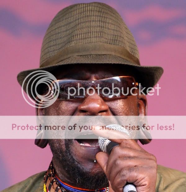
MemberI really like the first one, the expression is great, as is the composition. Its nice and sharp too.
The second seems to me to have potential yet I think that the bottom is cropped far too tightly. It’s also not nearly as sharp as it could be.
The third just doesnt do anything for me. Theres too much going on in the background I think, and while the face seems to be more or less well exposed the shirt has many blown areas.
It’s a good set of shots though. Good job :)
Liam2673
ParticipantWould agree re the third……the first two work much better, better composition and better facial expressions……goes to show that the face is much more important than what people are wearing. I’d imagine with this type of photo, you need to take several to get the one thats right, as with the first.
In the second, I’d have a tighter crop at the top, and as mentioned, less tight at the bottom – I don’t think you need all the hat, its a bit distracting, just the brim would be enough…… Also, I’d say the second might work well in black & white.
petereoin
MemberThank you for your comments, its the only way we can learn and get better.
I put the seond photo in because I thought it was cool that you can see the crowd in the performer glasses.
The third photo, I have to agree, not my best shot, even though I have others of that show.
You must be logged in to reply to this topic.


