Homepage › Forums › Photo Critique › Landscape › Howth Head
- This topic is empty.
Howth Head
-
con20or
ParticipantI took these on Howth head two sundays ago, was a great sunny day. Ive left a tiny bit of saturation to the B&W ones, i think it adds to the contrast. 0 saturation just looks dull to me, maybe im doing something wrong..
Looking at them there, they seem alot greener than they are on my screen. I think photobucket is messing with me, the first two times I uploaded these onto this post the quality was crud. Whats the best site for file hosting?
C&C very welcome,i’m at the bottom of the learning curve.
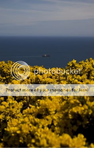
Trawler Leaving Harbour.
Trawler returning later in the day.
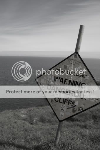
Grafittie sign on cliff.
con20or
Participantderrycity
Participanthi #1 appears badly exposed ie to soft
keep trying like myself you will get there.5faythe
ParticipantHi Conor,
Don’t get downhearted if you don’t always get replies to
your posts.
We all get missed along the way.People use different sites for hosting.
There are some good tips on here as to how to embed images.
If you need help or links to these threads ask.#1 is titled “Trawler leaving Harbour” yet the trawler is very small in the
frame, almost insignificant. The trawler is also out of focus.In #2 the title also suggests that the trawler is the subject.
The image is a little murky and lacking in contrast so the boat
is kinda lost.I presume in #3 you were showing the warning sign kind of “vandalised
with the stickers nearly covering the words.
It dosen’t really impact on me.
Maybe it’s the composition. For example the sign breaking through the side of
the frame.These are only my opinions.
Cheers,
John.
con20or
ParticipantThanks for the replies!
Here was my thinking behind each photo, maybe someone could tell me where Im going wrong.
1. The trawler leaving harbour was meant to be blurred, i was going for the focus on the flowers, messing around with aperture etc. i have a landscape version that shows the boat a bit better. Maybe my use of titles is off, to be honest I just stuck them on for ease of reference.
2. Your right, it is kind of lacking in contrast, I had to mess around with the exposure in PS to get the sky to show up properly.
3. Just liked the shot, good point on the corner sticking out…
You must be logged in to reply to this topic.


