Homepage › Forums › Photo Critique › Street and Documentary › Fellucas of Egypt
- This topic is empty.
Fellucas of Egypt
-
bingbongbiddley
ParticipantHowdy, a couple from my FM2 using ISO 1600 film – Neopan I think.
Feedback mucho appreciato.
Alan
Mast
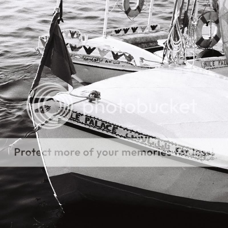
Nile Palace Eye
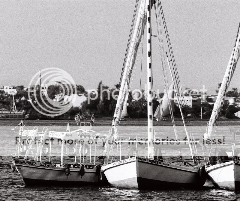
Trio
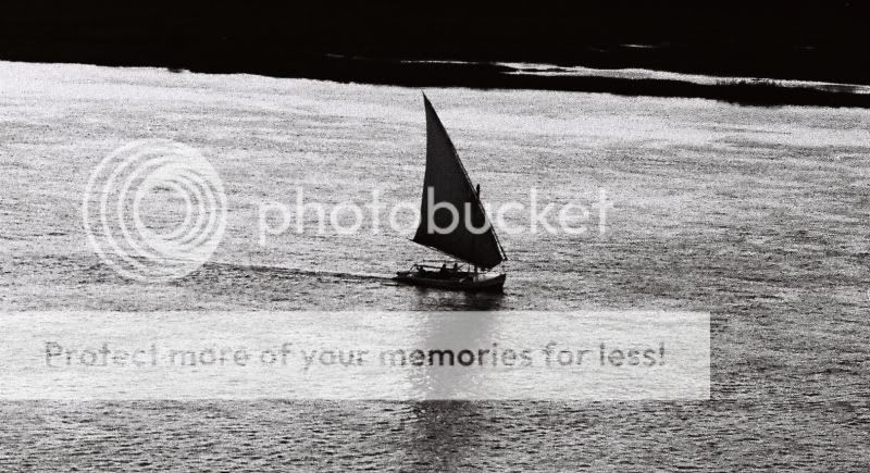
Cruisin’
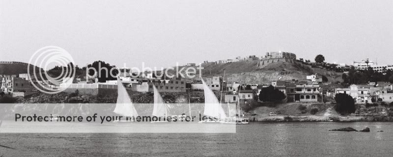
Aswan Harbour
MartinOC
ParticipantThe last 2 work best for me, especially Cruisin’, that is really cool.
The only one I don’t get is the first.I think Trio would work better with about half the sky chopped off.
As the mast is cropped but mostly in the photo, it gives a less satisfying effect than if it was cropped more. Like tilts, a bit can be jarring but a lot can work well.
And it would give a stronger horizontal theme, with the stripe of boats, stripe of water, stripe of buildings/trees and a stripe of sky. Just an idea.That’s my thinking, would love to see more.
Martin
bingbongbiddley
ParticipantMartin, thanks a lot, I appreciate the reply.
Cruisin’ is probably my favourite here too. And I like Aswan Harbour but the framing’s a bit too loose on it I think.
For the first one I was trying to go for something a little abstract – just show a feature of the felluca with the landscape in the background – that’s what I liked about it. When you say you don’t get it what do you mean exactly? Do you just think it’s rubbish, or you don’t think it works, or you don’t know what I was hoping for? Part of it still works for but in some ways it is a little haphazrd and I could have composed it somewhat better I think. The tops of the boats at the bottom of the frame don’t add anythin. It might have been better with just the mast in it.
Trio may be slightly messy too looking at it with your feedback in mind. I agree about taking some sky out – it would improve it. I’ll try that when I get onto the right computer.
I don’t like the fact that some of the boats I included aren’t fellucas – didn’t really notice that in my ignorance when I uploaded them. :)
Not sure if I have any more fellucas from my films but I want to get around to editing a few of the digital captures so watch this space.
Thanks again,
Alan
MartinOC
ParticipantWhat I meant with the first one is that for me it doesn’t work, the shaft of the mast dominates the shot, and in itself isn’t interesting.
My eye is drawn to the dark part which is the highest contrast with the sky.
It might work better with the boats cropped out, be more of a abstract shot, as you say, but at the moment for me it seems to be contain more distraction than theme.
Just my opinion now.In real life the other boats may look tacky compared to the elegant fellucas, but it doesn’t really come across in the photos.
For me the different styles of boats blend in well and add to the photos. Its not like having one of the terrible cruise ships in the scene.Martin
You must be logged in to reply to this topic.


