Homepage › Forums › Photo Critique › People › Dearbhaile Again !
- This topic is empty.
Dearbhaile Again !
-
MDCPhotography
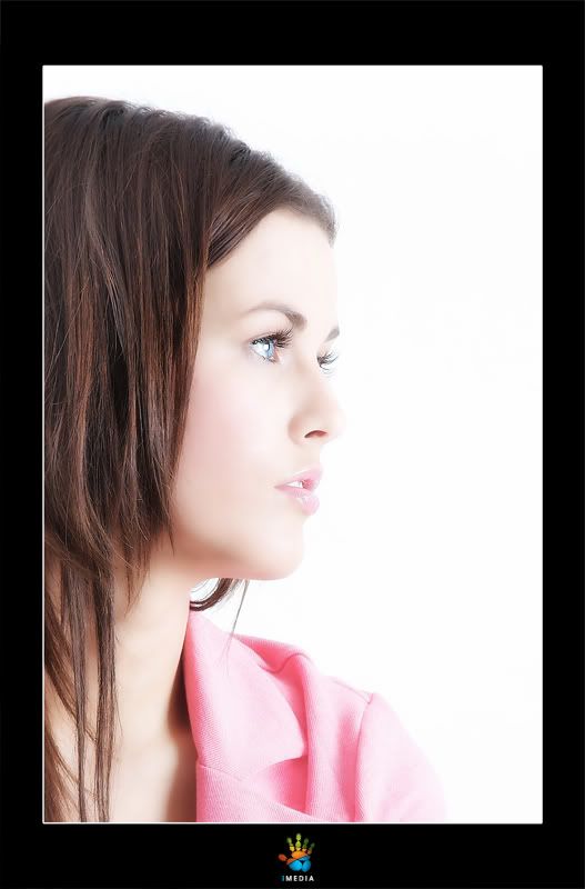
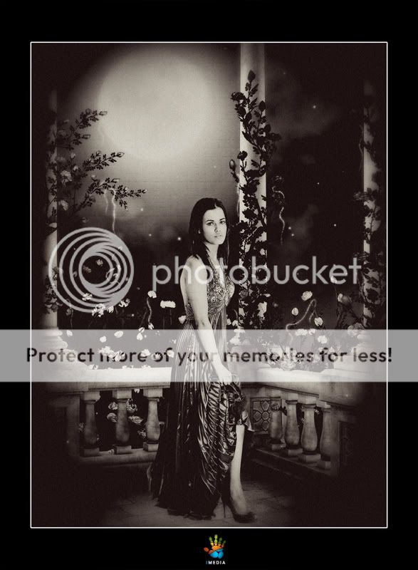
ParticipantA few shots from a wee shoot for one of our resident models in work. I done a wee bit of post processing and was messing about with different backgrounds for the last one. Please C&C most welcome.
Thanks
Broadford1
ParticipantSodafarl
MemberMarty,
Nice set I like 1 and 3 but think they would have been a lot better if the body and face weren’t blending into the background. She looks to be a very pretty girl and I don’t think the white background particularly in 3 does anything for her.
If taht makes sense.
Any without the white background.Soda
Tiny
MemberHi Marty
Lovely set of shots, personally i realy like the 1st and 2nd shots over the other two, great detail in the 2nd shot, but i would echo the point made by Soda about the body and face blending into the background
Niall
BM
ParticipantI like 1 and 3 but find her hair to be a bit untidy. The pose in the first could seem very unnatural, but not this time.
Maybe if we could see a bit more of the left eye in number 3?
I don’t like the PP or soft focus used in number 2.
Number 4 isn’t my thing.
Hope this helps – portraits are not really my thing – but I like pretty girls!
Pixelle
MemberLovely pictures of a very pretty girl, the only thing that grates are the shoes.
In #1, they are a bit clunky [technical fashionista term!] and the glimpse of the second heel doesn’t help.
In #2 the shoes themselves suit the dress, but they seem posed a little awkwardly if you see what I mean, or perhaps I am making no sense [as usual.]
You must be logged in to reply to this topic.


