Homepage › Forums › Photo Critique › People › Lisa
- This topic is empty.
Lisa
-
wesleylaw
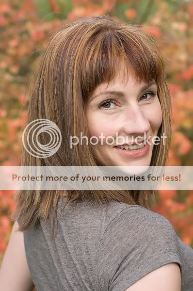
MemberThis girl asked me recently to do some portraits of her so off we went to Fota gardens. Even though she was into posing and was good at it I found those shots all a bit rigid. These were grabbed really but I think I caught something of her in these. Maybe it was due to the fact that we both started to have a laugh soon into the shoot. Any opinions on the shots?
5faythe
ParticipantHi Wesley,
I think you have probably caught something of the lady’s character in these.
The expression seems very natural and attractive.
She has engaged well with the camera.I somehow prefer #1.
I’m not sure that all that space is necessary to her right in #2.That, of course, is just my non expert opinion.
Cheers.
John.
wesleylaw
MemberThe expression seems very natural and attractive.
She has engaged well with the camera.Thanks John,
I think thats why I like them too. I agree about the space too her right.Thanks for commenting.
Mark
KeymasterJohnnyMcMillan
ParticipantHi there.
I like the first shot. Nice overall tones and looks like a nice genuine smile/moment. Just for me when I scrolled down to the second shot it just looked a bit like a copy of the first shot and so therefore diluted the first for me. I think if it was just the first shot by itself that would have been great, just the second shot takes that “moment” away from me abit.
wesleylaw
MemberThanks. I didnt see the second one as being very similar to the first but now that it has been pointed out…
5faythe
ParticipantHi Wesley,
I understand JohnnyMcMillan’s comment re the similarity of the 2 shots.
I didn’t mention it on my post but I thought that if you had a more straight
on shot from your shoot you could crop #2 to the same composition as #1
and the 3 shots would make a nice set side by side with the straight on
image in the middle.Just a thought
Cheers.
John.
jb7
ParticipantI suppose it shows how symmetrical her features are,
that she can be photographed from both sides like this-Would agree with John about the space to the right in 2,
and I suppose I might also mention that the first might be just a little closely framed-Would be interesting to see the ones you haven’t shown too-
especially if they were showing a different expression-I suppose there might have been an option to underexpose the background slightly?
there might have been a bit more drama to them if it was a little darker-Good pictures though, she should be very happy with those-
You must be logged in to reply to this topic.


