Homepage › Forums › Photo Critique › Landscape › Swamp
- This topic is empty.
Swamp
-
fstop89564
Participantshutterbug
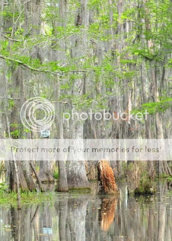
ParticipantHi Tim, when I first looked at these shots I thought the contrast was all over the place,
but on revisiting I am starting to think that this is the actual colour of the trees, it is a
kind of eerie looking photo but I guess that swamps are eerie? I like them anyway :)
(the shots not swamps :shock: )fstop89564
ParticipantMark
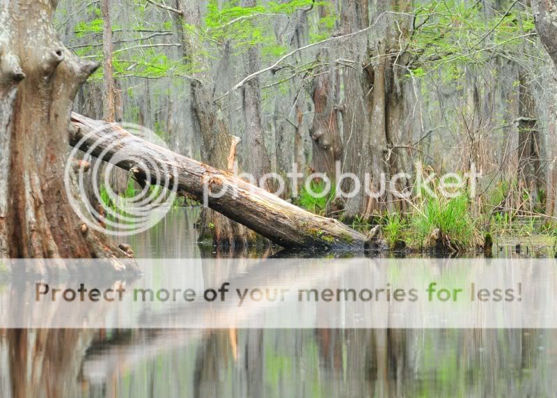
KeymasterI like that 2nd one alot Tim. Tree on the left looks a bit soft or something, maybe just needs some additional sharpening ?
Then again maybe its just out of focus.Cool place to find yourself
fstop89564
ParticipantMark
It is a tad soft and the higher rez on the print it all looks good, in my opinion, but I try not to post images with to high of a rez because of folks taking images. Not really printable. It was a cool place and it looked like selective coloring but that was just natures way of doing things here in the swamp.b318isp
ParticipantFor a swamp I was expecting a darker image, maybe half a stop less, especially on the first. The second has a much better point of interest but I’d suggest considering other crops – such as square (looses the dead space to the right) or more letterbox (increases the dominance of the trunk).
RASMITH32
MemberNice shots, just a little too soft though. They remind me of one of my favourite films, “Southern comfort”
You must be logged in to reply to this topic.


