Homepage › Forums › Photo Critique › Landscape › Fastnet Lighthouse at Dawn (new image added)
- This topic is empty.
Fastnet Lighthouse at Dawn (new image added)
-
wesleylaw
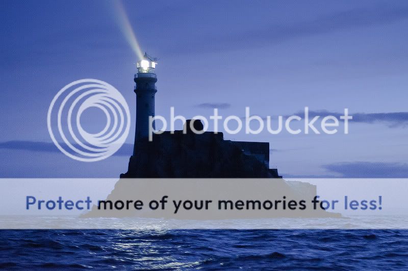
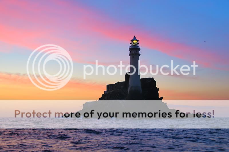
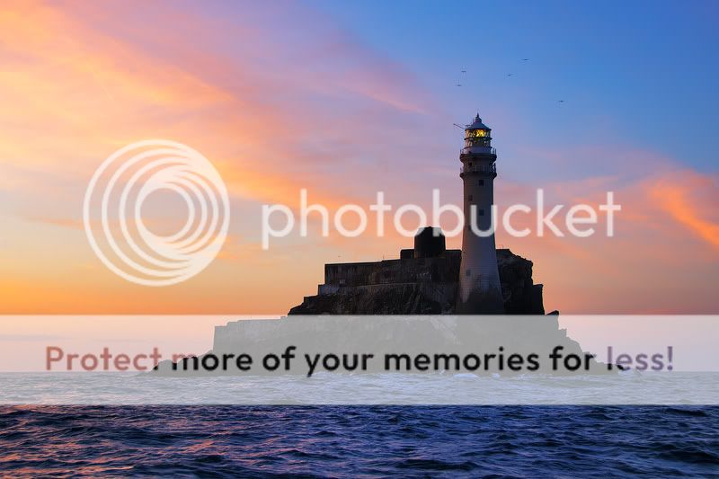
MemberThis summer I had an oppurtunity to photograph the Fastnet at dawn. We headed off from the South harbour of Cape Clear about 4:00am. Freaky it was waking up and sailing off in the black dark. We circled it for over an hour. It was amazing to approach it in the dark and watch it slowly change. Here are a few from that morning. Im not really sure about them so any comments appreciated.
shutterbug
ParticipantLove the third shot, nice colour and the birds around the top of
the lighthouse…nice!ossie13
Participantb318isp
ParticipantDaveMurdoch
Participantreally love #2 and #3 8)
I`d love to see it on a stormy day :) but not much chance of that unless you`re in a really HUGE boat :wink: :lol:Zargon
Membergreat shot in 3 , lov the colors , i agree with above re_crop and maybe a bit of dodge and burn on the rock…
streetshooter
MemberThe colours in 2 and 3 are nice, but you could have captured the same in lots of easier to access places.
No. 1 is special – it accentuates the remoteness of the lighthouse – and light reflected off the sea is
positively eerie.
Very well done though on all three!Nos
ParticipantAedanC
ParticipantNumber 1 for me, very atmospheric. The others are good but they don’t have the same atmosphere of remotenes.
I usually visit the Fastnet a few times each year so I appreciate how difficult it is to get dawn and dusk shots there, well done.
Aedan
Green Meanie
ParticipantNumber 1 gets my vote too, special.
I would clone out the birds in #3 too as they look like specs of dirt on the lens as opposed to birds and cause distraction.
If they were bigger and more obvious then they would be grand, if ye see what I mean?
wesleylaw
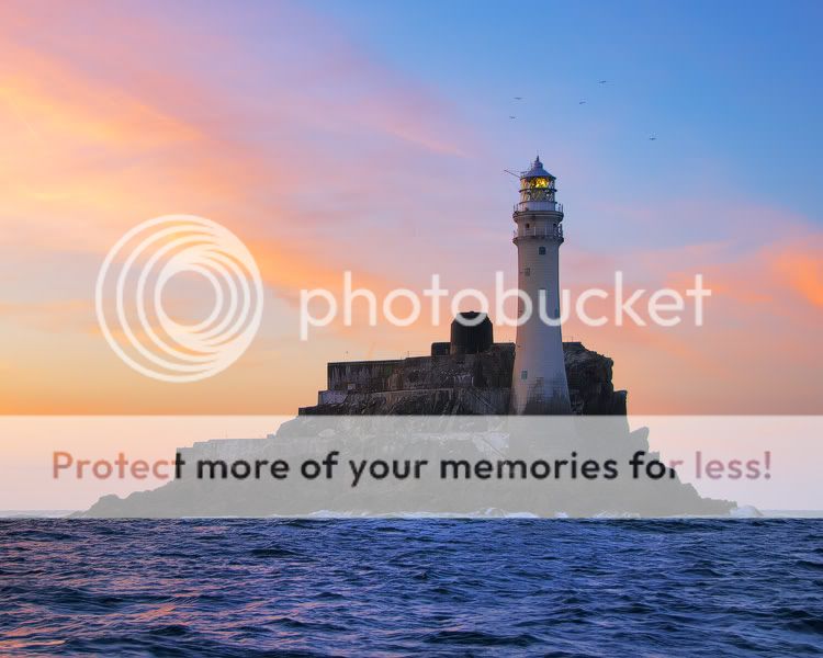
MemberThanks for all the comments everyone. I cropped the third one and did a bit of dodging and burning. I will have to come back to it another time to see if the crop works better for me, but I do think the dodging and burning is an improvement.
ThanksAedanC
ParticipantHmmmmm, in my humble opinion the crop is a bit too close now. Just my opinion like. I like the subject of a photo to have a bit of room to breath…..
Aedan
connie
Participantnice set of 3. I love the colours in 2 and 3 but I keep going back to the first one and find it more appealing the more I look at it.
miki g
ParticipantI also prefer #1. The cold & isolated atmosphere works best for me. I would love to see a foggy version of this but won’t ask you to get out of bed at 04:00am to re-shoot it. :lol:
Zargon
MemberLike the Dodge and burn on the rock, I would hav croped out more of the sea and kept in the horizon and sky, looking good.
Clive.
You must be logged in to reply to this topic.


