Homepage › Forums › Photo Critique › Landscape › Frosty Morning
- This topic is empty.
Frosty Morning
-
Bannerminis
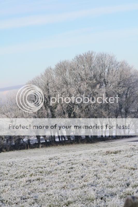
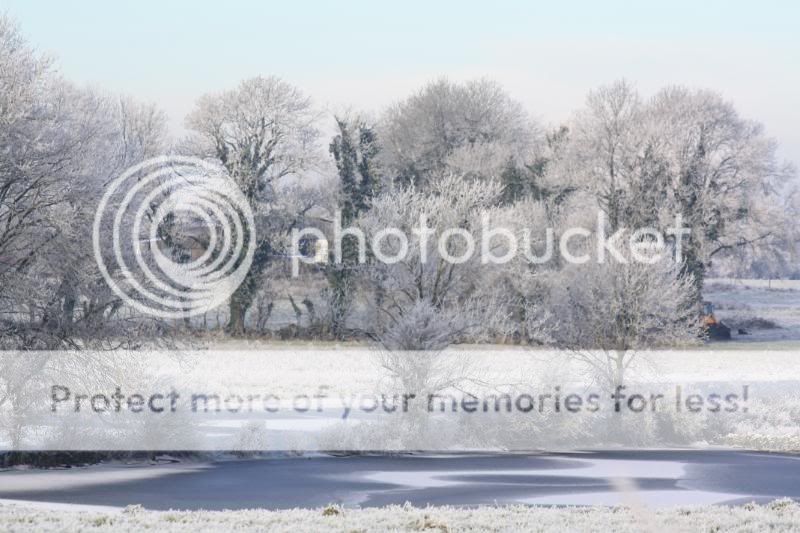
ParticipantA couple of pictures from the field next door to me.
I could have straightened this but I kinda liked it like this.
Probably not a great pic but I feel cold looking at it :) .
fguihen
ParticipantI think that the slant in the 1st one just looks unbalanced. its very very rare that a slanty horizon looks good in a photo.
The photos are quite soft also and there is no real object of focus or anything to lead you into the photo (except for that out of focus object in the bottom right corner).2nd one is again very soft and there is nothing to draw me into the photo or definite focal point.
The photos are quick snaps of a frosty morning. Fine as snaps, a factual record. But, they dont draw you in, engage you, get you thinking or stirr up memories or emotions.
A good or great photo should lead you in to it, give you something to focus on. also generally a photo ( especially a landscape) should be really sharp.
Im not saying all that to be harsh, god knows i have directories full of photos like these! Use these photos to identify your weak points and work on them to get better photographs. Hope my criticizm was constructive.
Regards,
Bannerminis
ParticipantThank you so much for taking the time to critique my photos.
Its the only way I will learn so much appreciated so will try to take it all on board and try again on another frosty morning and going by the way they are talking I might have loads of opportunity :roll: :D
You must be logged in to reply to this topic.


