Homepage › Forums › Photo Critique › People › A ‘thank you’ job
- This topic is empty.
A ‘thank you’ job
-
lousy
ParticipantIsabella
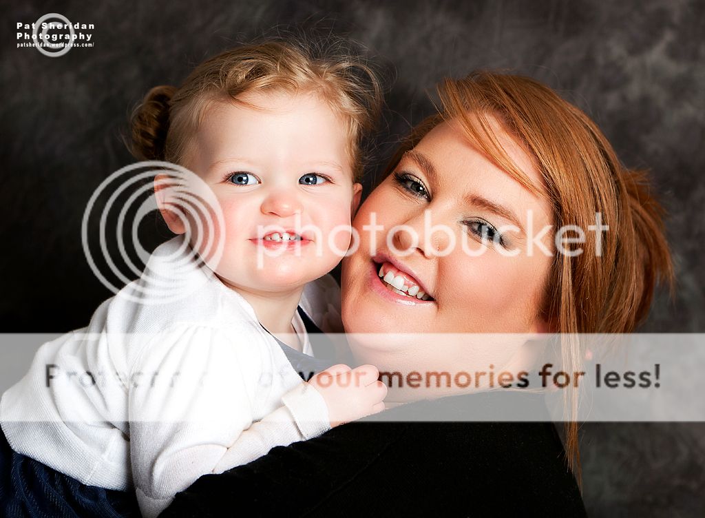
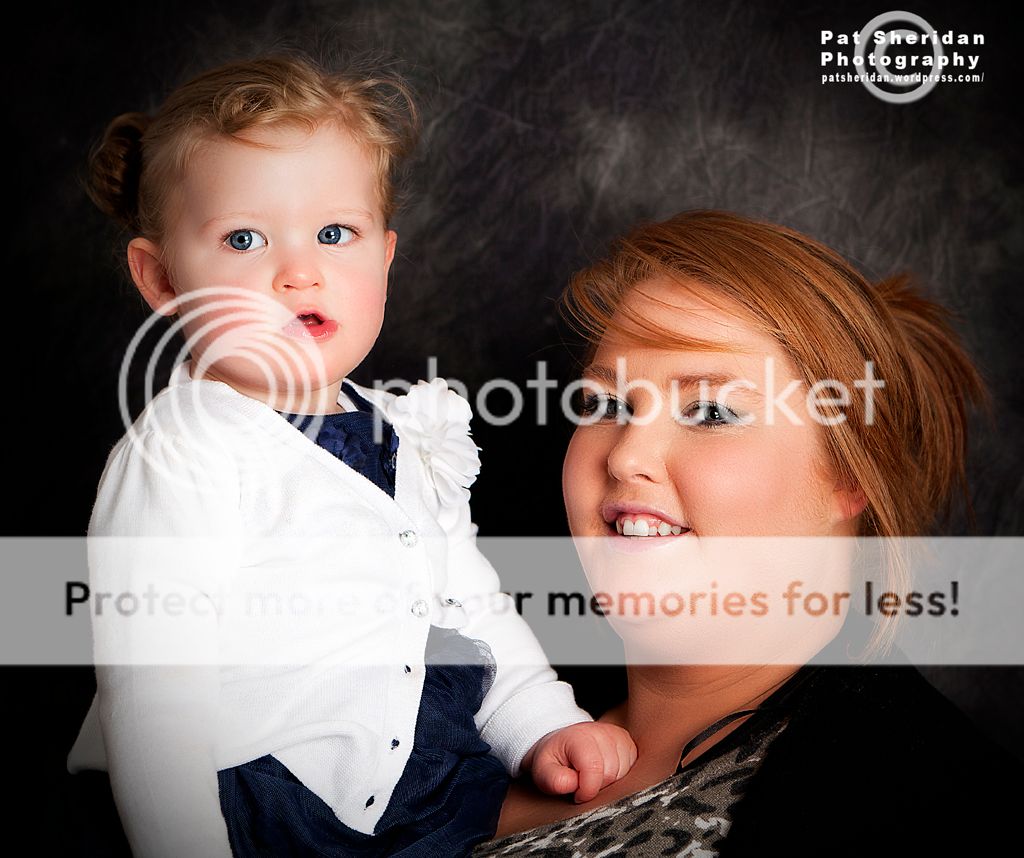
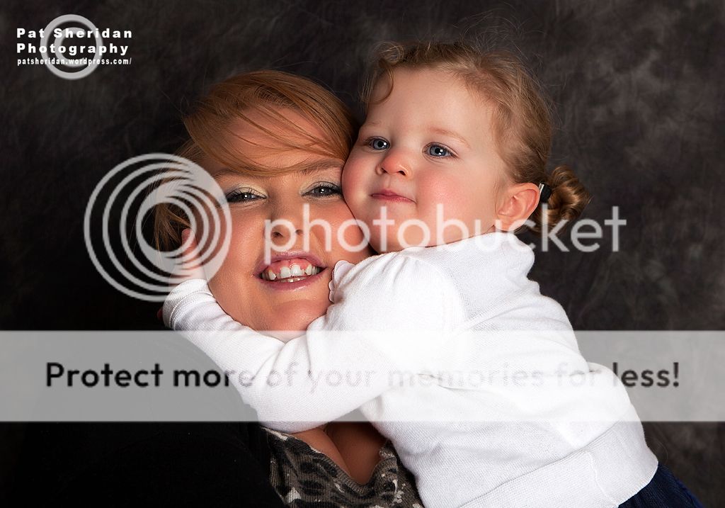
Participanti really like how the colours came out in the first 3, the lighting seems to be working really well.
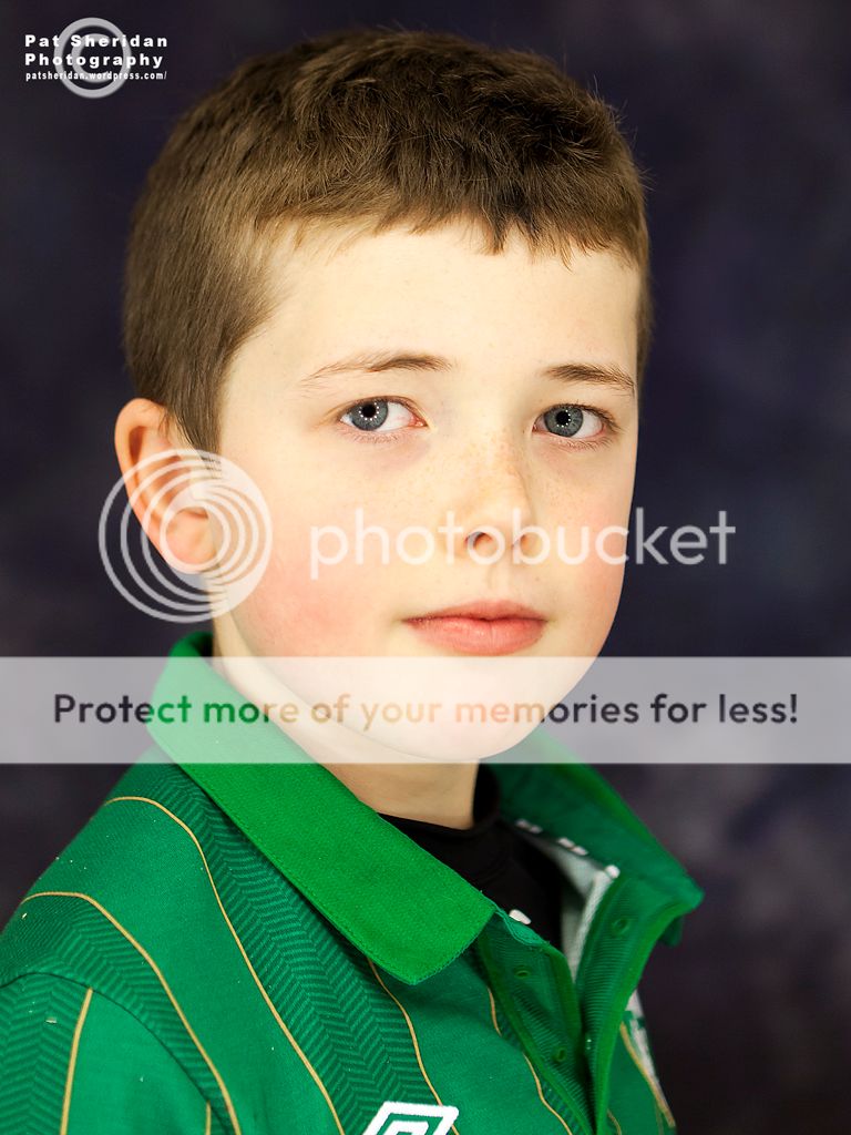
the fourth one is not so effective for me. the catchlights in the eyes are a little wierd and there seems to be something a little off about the skin tone? maybe a tiny bit yellow? seems a little flat in comparison with the first set, though perhaps this would be remedied by not displaying as part of a unit with the first three…
lousy
ParticipantThanks Isabella for taking the time to have a look and giving a critique…I really appreciate that.
On the first three I used softboxes and had done a grey card custom white balance.
On the fourth I dispensed of the soft boxes and used a ring light. This particular ring light is an approx 3 ft round ring with 12 tungsten bulbs as the light source. I also did a grey card custom wb, but whatever happened I obviously didn’t get the wb right. I think I might be flogging that ring light soon :?
Thanks again..
Pat
sndipo
MemberVery nice lighting. Like the background and great expressions.
Agree with Isabella on the fourth, the eyes look rather distracting..lousy
ParticipantIt’s great to get this feedback as it gives me an idea of which lighting system is best, or in fact whether to even use the ring light again :| . I have taken better images with that system and some people have said the same as yourself re the catch light, but at the same time people like it also.
Many thanks for your input, appreciated as always.
Pat
You must be logged in to reply to this topic.


