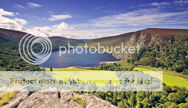
Homepage › Forums › Photo Critique › Landscape › Sally’s gap /Roundwood.
- This topic is empty.
Sally’s gap /Roundwood.
-
_brian_
ParticipantValentia
MemberI like it Brian. I just tweaked it a bit. I used a velvia action and added a gradient to darken the sky. Added a little USM. too. The amended version is on Flickr but it’s marked private but you should have access to it ;-).
Click on the picture for a larger version.
kenmurphy
ParticipantBrian
nice shot just makes you want to get out and go for a walk
scary road up to that sight
_brian_
ParticipantCheers ken ,
Valentia ,thanks man for that ,the sky is a lovely blue , I used a polariser for another shot and it didn’t come out right at all.
I spent an hour or so around there ,trying to get to grips with the 10-20 lens .I found myself half way down the mountain at one stage .Didn’t realise until I had to come back up how fat I am :o :lol:PS The sooner the weather gets colder the better ,the haze will lift I hope.
Thanks
Brian.davenewt
ParticipantValentia, couldn’t view the larger version of your modified shot, private page on flickr?
I like it though – very rich colours. Perhaps a bit too rich for “reality”?
This was my attempt from last year, of the same location but from a different viewpoint (jumped out of the car for 30 seconds, it was blowing a hoolie!):
http://www.mondaymorningphoto.com/index.php?showimage=6
Take it easy,
Dave._brian_
ParticipantProbably my monitor dave ,It was really just to see how much I could fit into the sigma 10-20 lens.
To me it looks as it was .Thanks for the comments.
Brian.Valentia
MemberGood shot there Dave. I’m a divil for the ol’ saturation I’m afraid, a side effect of a boring, grey life I suppose :D
SteveD
ParticipantBrian,
I like the image, reminds me of the lower Alps in Bavaria, Germany. The shadows were a bit harsh for my liking so I used contrast masking to bring out shadow detail and control highlights in the sky. I then added a standard gradient to a new blank layer in PS, and used the overlay blending mode.
This is the result, let me know what you think:
Mick451
Participant_brian_
Participantthanks steve and mick ,steve I think because my monitor is not set up right the image you’ve done looks a little harsh on my screen :(
Mick I like the way the darkness brings out the lake and hides the haze ,is that called vignetting ??? .Cheers for the edits,
Brian.
You must be logged in to reply to this topic.


