Homepage › Forums › Photo Critique › Landscape › Newcastle, County Down
- This topic is empty.
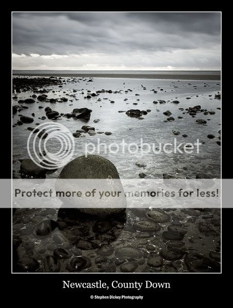
Newcastle, County Down
-
SteveD
ParticipantNormally I would be the first to introduce warmth into a landscape, but tried a colder, more moody look with this one.
Hope you enjoy, feedback welcome! And look at that horizon, so darn straight lol!
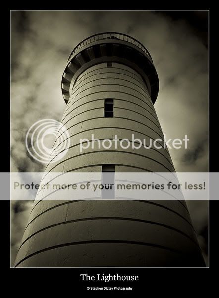
Ok, and now this isn’t exactly a landscape, but thought I would just fire it in along with the one above. Feedback welcome, hoping for an architecture forum soon.
LoGill
ParticipantMy only critique is admiration I’m afraid… :?
Yeah, I agree the cold tones in the first shot really work …. adds a really gloomy feel. The second lighthouse shot I just love the perspective you chose.. its gorgeous !
:)
Lorraineciaran
ParticipantSteve, your work is just f**king amazing (excuse the language). Superb photos.
SteveD
ParticipantLoGill & Ciaran, thanks very much! I was pretty happy with these two. I’m trying to introduce more ‘mood’ to my photos, instead of making every shot look like it was taken on a sunny day!!
Mark
KeymasterTwo very fine shots Steve. Love the tone of the first one, also the clarity of the water with the stone
showing, very nice.Second one is very moody. Good work
Mark
Roberto
MemberI love the lighthouse, very good angle of the shot.
Not sure about the first one. It’s just my feeling, strange sometime…Valentia
MemberRob
Memberrichiehatch
MemberNice work Steve… Lovely pics… The first is really nice… about as close to a monochrome image without actually beiung monochrome…! You definitely captured mood…. I have taken many images very similar to this along the Louth coast but always feck around with the white balance (in the Raw converter) to add tone and colour…. In future I will try a look similar to these…!
The second is lovely too… I like the vignetting effect at the corners…. adds to the image I think..!
Richie
andy mcinroy
ParticipantSteve, that first image is superb.
Just goes to show that you don’t always need warm light for landscape photography. A lovely simple image with bags of depth.
And the horizon is as straight as a die, Carl and I checked it with our protractors.
Andy
ellude
ParticipantHi Steve – I’m going to buck the trend and say the first shot doesn’t really do much for me. It just seems empty and in need of a point of interest (I don’t regard the rock in the foreground as ‘interest’).
I like the second picture much better!
SteveD
ParticipantThanks very much to everyone who commented, all greatly appreciated.
Richie – I used to be afraid of cold tones in landscapes lol!
Ellude – Part of the aim with that photo was to show the bleak, vast and empty area in the best possible way. I think the rock, although pretty boring in itself, really grabs the attention of the viewer and gives them time to appreciate the soft glow on the water, the subtle blue tones and the peaceful feeling the photo promotes! I’m not usually one to get all soppy about a photo, but this is one I’m really pleased with!! :roll:
You must be logged in to reply to this topic.


