Homepage › Forums › Photo Critique › People › A couple of my mate
- This topic is empty.
A couple of my mate
-
sean1098
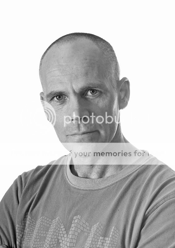
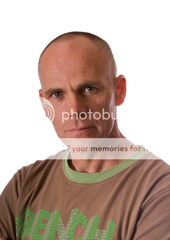
MemberTook a couple of shots last night of my mate. Opionons plwease on these two.
Thanks,
Sean.
lousy
ParticipantBoth very nice Sean although I prefer the second as the colour adds character to the face and you’ve captured everything in great detail.
Pat
sean1098
MemberThanks for feedback Pat. I actually like the colour aswell, but my mate wants the mono printed.
Sean.
Rob
MemberThese are very good Sean. Colour for me too, though the black and
white could edge it with a little contrast added.
Hope you don’t mind. I took the liberty of editing this with two curves
layers, one for highlight and one (inverted) for shadows, to boost the
contrast levels…Rob.
Alan Rossiter
ParticipantWhen it comes to people photography I think you can’t beat B&W. For record shots of events then colour is fine and dandy but for artistic poses such as these the colour doesn’t take away anything from the image and character is what you get. SO, #1 for me, if I was to vote.
Rob – 2 curves and inverted the shadows curve? I’ve never heard of this before. Why and what does it do…apart from the obvious detail enhancement in your edit.
Alan
Rob
MemberMost people tend to use an ‘s’ curve for boosting contrast, but I find
that this can also lead to colour shifts. Where as two separate curves
layers for highlights and shadows gives you far more control.
I wrote a really rushed tutorial for John (nfl) some time ago
showing what I meant. Perhaps he still has it somewhere. Or else I’ll
go and hunt for it…Rob.
sean1098
MemberThanks for feedback Rob and Alan.
Thanks for the tip on the curves Rob.
Sean.
Biddy
ParticipantCould you explain the technique with the layers RoB?
I would apprecite it.Lovely shot. I prefer the b and w version.
Allinthemind
ParticipantI like his expression. I don’t like the stark white background (but then again, I am on a campaign to erradicate the white background look, hehe). The backlightcoming in is hitting his cheek, not for me, I’d rather see some shadow here. The composition is very central, which is ok for a headshot but perhaps you could have done more?
Si
You must be logged in to reply to this topic.


