Homepage › Forums › Photo Critique › People › A portrait from Kinvara
- This topic is empty.
A portrait from Kinvara
-
deeorgan
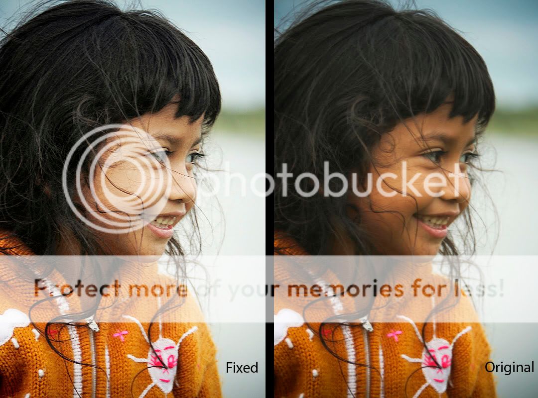
ParticipantI captured this lovely little girl at a festival in Kinvara a couple months ago. Love to hear your thoughts.
Thanks,
Deeellude
ParticipantLovely expression on a happy little girl!
Maybe try adjusting levels/curves some to add a little contrast?
deeorgan
ParticipantThanks. I was worried I was getting carried away with curves lately so avoided using them for portraits, to keep them more natural. But I’ll give it a go and you can decide which is best.
Cheersdeeorgan
Participantellude
ParticipantApologies that I’m only getting a chance to reply now!
The second version looks better to me. You are going in the right direction but maybe need to go a little further. I took the liberty of ramping up levels/curves a bit more to see how the pic would look (maybe a smidgen too much, but you get the idea….)
deeorgan
ParticipantYeah, that looks good. for some reason I’m a bit weary of overdoing it with portraits, so I kept it subtle. But I like what you’ve done with it. Nice to see someones else interpretation. thanks for taking the time.
DeeBroadford1
Participantdeeorgan
Participant
You must be logged in to reply to this topic.


