Homepage › Forums › Photo Critique › Catch All › A single sheaf
- This topic is empty.
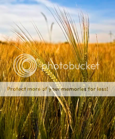
A single sheaf
-
lousy
ParticipantI was going to put it in landscape but changed my mind.
Hunting around today for decent locations for when the crops are
harvested and the straw baled and came upon this one which will be very
nice when harvest time comes.
Anyway this image appeals to me and I would be interested to hear other thoughts.
Patjessthespringer
ParticipantThats lovely Pat, the light is really nice, really like the colours too. It has a real summer feel, which I think makes it appealing.
Sinead.
lousy
ParticipantThanks for the reply Sinead.
Yep very summery there yesterday… not so today though, the rain is back
Looking at it again though the sheaf doesn’t stand out as I thought but that’s what
I was after. :cry:Pat
Rob
MemberBeautiful colours Pat, though there’s more in this image than it
really needs; you could easily crop in from both sides, particularly losing
that dark mass at the back on the left side, and your image would lose
nothing. Very nice detail…Rob.
lousy
ParticipantPunk Rock
MemberWhile that dark mass was a wee bit distracting I think the cropped picture doesn’t show of the quality and sharpness of the sheaf nearly half as much as the original picture.
aoluain
ParticipantYea I like both versions of theis image but for me
the original is more striking.
You get more of a feeling of walking through the crop on a
warm hazy summer day with only the birds talking to you!
the second image renders it to a study alone on the sheaf!Mr.H
ParticipantGreat detail in this Pat – especially the top one. Would be interesting to see it printed as it looks fantastic at this size.
.. and yes – as far as I am concerned this is landscape.
lousy
ParticipantThanks for that Gary.
TBH I can’t see the detail in it and of course I was focussing on the ‘single sheaf’ but I fail to see the ‘stand out’ look I was after.
Having said that it could be my monitor.Cheers for the feedback Gary, always nice to get it.
Pat
pihjin
MemberGorgeous colours here.
I have to say I like the original better. There’s a nicer contrast between the sharp sheafs and the out of focus ones and it gives then more ‘pop’ in the frame.
Great capture though.
wexkel11
MemberHaven’t been checking the site for a while, trying to catch up. I must say I like the square image best, it brings the focus directly onto the ears of barley, excellent detail, nice one Pat. Mike
lousy
Participant
You must be logged in to reply to this topic.


