Homepage › Forums › Photo Critique › People › Any way to save this picture?
- This topic is empty.
Any way to save this picture?
-
nolonger
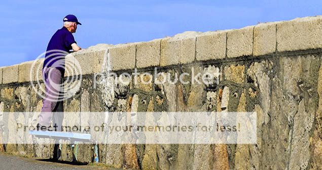
ParticipantSpotted this old guy peaking over the wall (when I went to the other side, it turns out there were two girls in bikinis sunbathing on the rocks. I’m not saying that’s what he’s looking at, I’m just saying that’s what I saw on the other side). I just don’t like how my composition ended up. Any suggestions? I’m thinking a bit of a crop would help it out.
ciaran
ParticipantCompositionally I don’t think it’s that bad. It follows a lot of the common rules in that he’s placed on a veritcal third line. The wall leads you into the shot. He’s looking into the shot etc
For me the biggest problem is that it’s a shot of someones back (well a little bit of his side). Apart from the odd rare exception, these shots generally don’t work. The next suggestion I’d have is to get closer! A crop might help, depending on the original image size, but the best thing would have been to zoom with your feet when the shot was taken. Id have at least halved the distance between you and the subject before taking it. Unless there’s something in the environment that you really want to keep in (which could be the wall in this case, to provide lines), fill the frame with the subject.
I know I crop pretty tightly in all my shots, but here’s an example of a shot of mine where I zoomed out a bit, because I liked the way the lines led my eyes to the guy passed out on the pavement.
Ah.. the wonders of the celtic tiger:
nolonger
ParticipantSo, realistically, I should have aimed to get a bit more of his face in… and maybe stepped it up so that I was composed a bit more like this?
ciaran
ParticipantYup… wouldnt have been any harm making a noise to see if you could catch him looking over towards you.
Swordie
MemberOr a more landscape format with the wall leading you towards the subject.
Roberto
MemberWhy you don’t make the part of the wall transparent and put the two girls behind…..? :roll:
You must be logged in to reply to this topic.


