Homepage › Forums › Photo Critique › Catch All › Bath
- This topic is empty.
Bath
-
wavydave
Member[/img]
Hi All
I’ve been missing from here for a while now. Hope this one generates some comments. Taken on a trip to Bath.
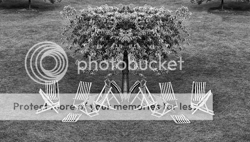
I call it “Banished” Look at it twice ;)Dave
LoGill
ParticipantWell I really like it – the symmetry you created works really well – I think I’d clone out the trees at the top – if they were fully in the frame great – but leaking out as they are they draw the eye out of the frame ..
well done ;)
L
jessthespringer
ParticipantI like it too, unusual… I think it might be mirrored from the centre?
I met a Polish photographer a few weeks ago, she rarely photographed people but everything (well, lots) shot had human interest, the shapes and lines made faces, this reminds me of that. Quirky, I like that.
I’d like to hear your explanation of it.
Sinead.
Deebo
ParticipantAgree on the clone or tighter crop just to keep in the banished chair
Tell us more
Deewavydave
MemberThanks for the comments.
Yes it is just mirrored down the middle with a couple of the chairs cloned out.
Roberto
MemberI agree with Lorraine.
It could be great in b&w as well + with one extra chair on the left…..
I playd with it. If you like, can send it to you.wavydave
MemberRoberto
Memberit’s very bad quality cloning but just for the idea….
what do you think?guthrij
ParticipantThis is cheating really but it looks quite pleasing:
Hope you don’t mind.
Cheers, John
wavydave
MemberThanks for all the comments and critique.
This is the one I ended up with. I called it “Banished” as the red one has been sent off for decking the blue one (pun intended hahaha). I liked the idea of it being a mirror ..but not exactly a mirror. That is why I cloned some of the chairs out, as I think it looks a bit obvious if it is all symmetrical. I guess it would work as a B+W but for me I wouldn’t do it with the chairs as an exact mirror. You can perhaps see why I cropped the back trees rather tight but I kinda had to leave them in too…they don’t really bother me that much though.
For interest I have added the original, as shot.
[/img]
terry
MemberI really like the mirror image idea. It brings a whole new interest to a shot. I also think changing something (no matter how small) on one side adds to the overall effect. For me the tree draws my eye to the centre where it looks like an owl’s face because of the mirroring.
Terry
randomway
MemberI liked the one you posted originally, I wouldn’t change anything on that. Contrast, colours and composition all working very well in my opinion. The one with the banished chair coloured red is somehow too much, there is no need to further emphasize the isolation.
Nice work.
bingbongbiddley
ParticipantThe first one is cool. At first I just thought, “big deal, he mirrored the image”, but when you see the “banished chair” it really adds an extra interest and almost gives the chairs a personality.
Well done.
You must be logged in to reply to this topic.


