Homepage › Forums › Photo Critique › People › Bethy Blue!!!
- This topic is empty.
Bethy Blue!!!
-
Swordie
MemberMight as well jump on the band wagon!
Here is one of my shots from the same shoot as Beast, Thorsten and Freshphoto.Bethscott
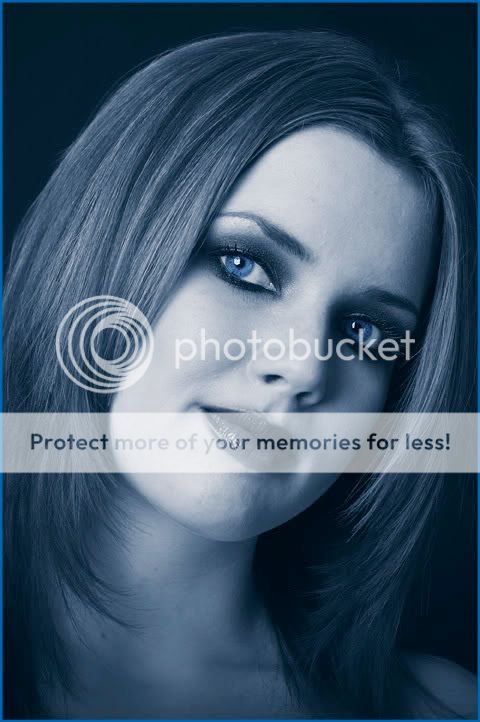
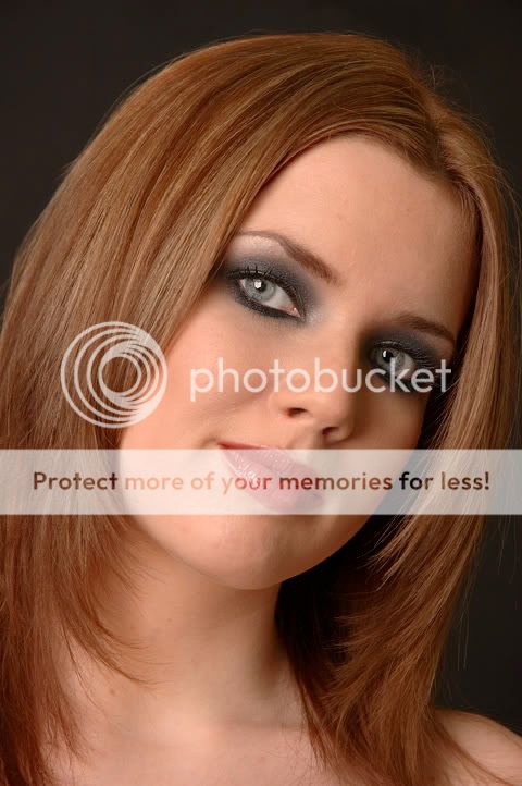
ParticipantWell for me it has to be the one on the left but my mom loves both so you are doing well there – or is she biased?!?! There was something mentioned by Fresh on another image about pulling out a bit as my face looked bit ‘fuller’ than what it is – can’t help thinking it is the same here? It may also be my angle and as I know nothing about photography it could also be a whole host of other reasons! For the one on the left I assume you picked out my eyes with a colour? Whatever I really like them – nice work!
Thorsten
MemberMust admit I prefer the colour one! The hair looks great and the eyes are gorgeous (and don’t need colour added IMHO).
Beth – as for not knowing anything about photography, you know a lot more than you think! Like I said before, I think it’s great that a model contributes to a discussion on images taken of her (or indeed other subjects). Gives us all a different perspective.
Rob
MemberColour one rings my bell too. Fantastic eyes. What was the lighting setup
for this one if you don’t mind my asking? Just a personal preference, but I think
more light on the hair might have given the image a little more depth. Great image
though either way. Nice work. Class model.Rob.
Swordie
MemberRob wrote:
What was the lighting setup
for this one if you don’t mind my asking?Rob, just one light on the left and a reflector on the right. Simple as that!
Swordie
MemberA couple more with different treatments.
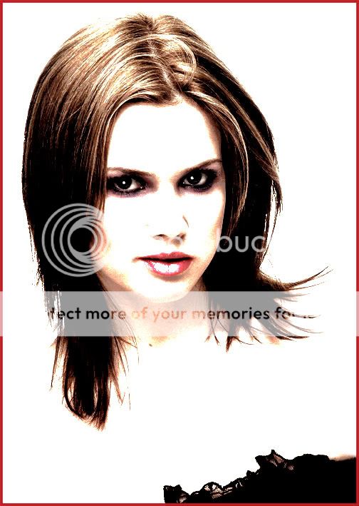
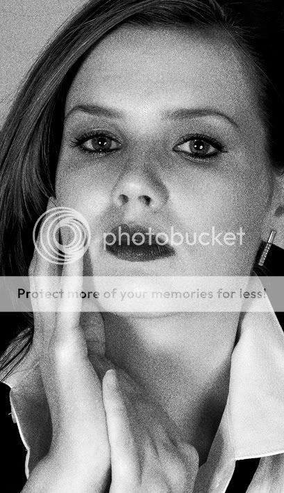
One quite graphic effect and one noisy b/w.
See what you think.Bethscott
ParticipantOMG Now these I love! Cant decide between gret for individual reasons – i have to get these off ya!
Beast
ParticipantSwordie wrote:
See what you think.
That one rocks my boat. Good work Paul!
Rhona
MemberHey Swordie
I was the makeup artist on that shoot….just said id throw my tuppence worth in too….The shots look great..Love the blue one and last one too…Well Done!
Rhona
JohnnyMcMillan
ParticipantFraid I’m not a fan on the blue one at all…I like the last shot though, but I’d get rid of the frame and clone out the black dress part..an image like that is better when it seems to be floating, not restricted by a red frame….
Rob
MemberThat graphic treatment is pretty cool. Love that image. Nice work. Thanks for answering
my query re. your light setup by the way.Rob.
Swordie
MemberRhona wrote:
Hey Swordie
I was the makeup artist on that shoot….just said id throw my tuppence worth in too….The shots look great..Love the blue one and last one too…Well Done!
RhonaThanks, Rhona. I heard you the first time! :lol: :lol: :lol:
Rob wrote:
That graphic treatment is pretty cool. Love that image. Nice work. Thanks for answering
my query re. your light setup by the way.Thanks, Rob. That lighting set-up refers to the first shots. There was a completely different set-up for the second two shots – using 3 lights (one lighting the b/g and two to the front, one left and one right)
KPM
ParticipantHi Swordie,
my favourite is the graphic style one – it looks really cool. Great shot & ps work.
If I had one quibble, and its only a small one, I would perhaps clone out the black material at the bottom and just keep it as head & shoulders.Rgds
Kevin
You must be logged in to reply to this topic.


