Homepage › Forums › Photo Critique › Catch All › Boyne Bridge another view
- This topic is empty.
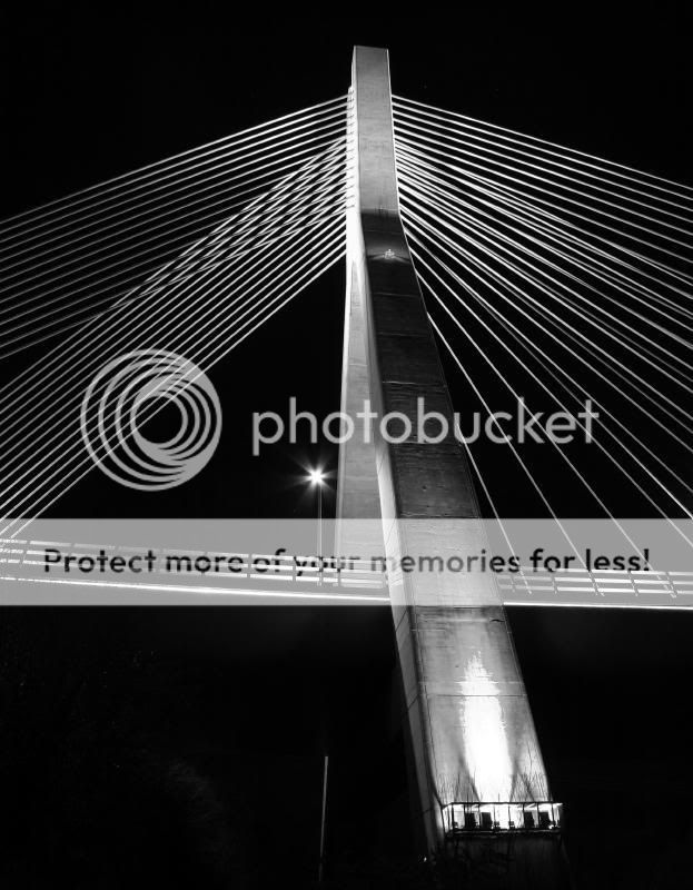
Boyne Bridge another view
-
crazygame
Participantirishshagua
ParticipantVery nice. Lovely contrast in this picture. I think the blown areas around the lights are a bit distracting, especially the light at the foot of the brifge but apart from that I think its very nice how the bridge seems to dissappear into the background.
Nice shot
BrianRoberto
MemberInteresting view.
I would crop the bottom to make ‘traingel’ with the lines. Also would clone out the light on the bridge, as Brian said, it’s distracting.crazygame
ParticipantThanks for the advice. I’ve no experience of photo editing but gave it a go with the canon software.
Amazing really…i’d never have thought to trick about with a photo like that. Thanks again!
[/img]Roberto
Membercrazygame
ParticipantCool! See what you mean about triangles there.
I kinda like the streetlight in the shot.Thanks!
jessthespringer
ParticipantI like your original post, I don’t think there is anything wrong
with the blown bit.. Would maybe just tidy up the bottom left
corner a bit. Like the street light too.Sinead.
crazygame
ParticipantThanks!
I can see how the blown portion is distracting but i think the edit I tried is a little boring without it.
Just grey concrete. B&W version accentuates the blown portion i think. Not nearly as obvious in the colour shot.
Glad you like Fr.Browne btw!jessthespringer
ParticipantIt’s small (the blown bit) and the exposure in the rest of the
shot looks good (IMO) I think the original would look the best
in print.Cheers for the Fr. Brown
Sinead.
Rob
MemberA beautiful bridge, and well photographed too. I don’t
think the blown bits, small as they are, are any real distraction.
Good capture, and a different from the usual angles we see
of this structure. Keep it up.Rob.
You must be logged in to reply to this topic.


