Homepage › Forums › Photo Critique › Catch All › Chabadabada … Chabadabada …
- This topic is empty.
Chabadabada … Chabadabada …
-
ulinka
Memberconstantine
ParticipantHey Urzula, where was this taken?
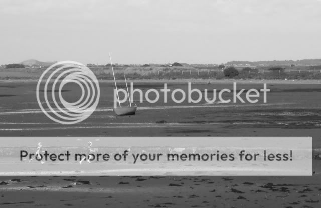
Its not my cup of tea, feel the post process is a wee bit too strong, but thats just my opinion!
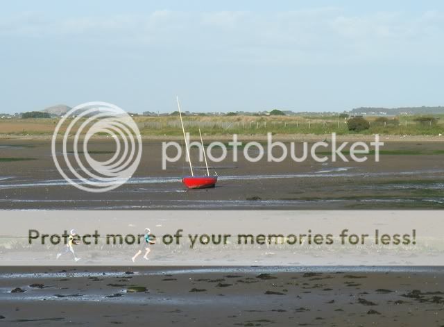
Overall though its an interesting shot, the two kids running into frame certainly adds something to the image, but I feel if you could have got a 100 yards closer, and used a lower perspective, filling the foreground with the kids and yacht, then you’d have a cracker of an image.
But again, thats just my opinion.
lousy
ParticipantHi Urszula, this looks to me like an old Irish scene with the kids running and playing etc…I don’t like the vignetting effect, but there is potential there.
Of course that’s only my opinion, to others it could be a cracker
cheers
Pat
irishshagua
ParticipantI like the darkening around the sides of the shot but I tink maybe it just hides one of the kids running a bit too much. But nice to capture the kids in the picture. Maybe slightly less of the shadows but I love the colour of the picture. Agree that it makes it look like a real old scene. Maybe there is just a tiny bit too much sky as well. Would a crop to remove some of the sky make any difference?
ulinka
MemberMerci to all of u 4 comments & feedback. I think I realised I definitely have an addiction to the vignetting effect… When not adding a light/flash effects on my pictures :s
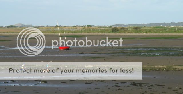
So here are some new pictures following your advises… And the original one, which I quite like.
Thanks, Urszula.irishshagua
ParticipantThe middle picture works best for me. The red is very eye catching and gives a little more life to the picture than the desaturated version.
ulinka
MemberDef. agree.
Didnt know what to do in the desaturated version to get something more balanced. I found it simply dead.
The middle one works out ok, but if u have any idea how I could improve, let me know.
Thx, U.jb7
ParticipantI’m confused by the title-
where does that come from?
The sound of children running in rubber suits?Maybe not-
Compositionally, I think I’d like to see this one taken a second later, with the figures going out of the frame,
to balance the boat- it seems quite stacked to the left.Red is a difficult colour to convert, I think-
I’ve got a picture of a red boat somewhere on these pages; I was persuaded to convert it to mono,
and I wasn’t happy with it-
it seems to glow, and lose weight and tonality-
I suppose one way to deal with it, if I had been bothered,
would have been to selectively change the colour before conversion-But as I said, I didn’t bother-
It would have produced a better, more natural tone in the picture though-
as I suspect it might do here too-But a totally minor niggle,
a herring of a comment, so to speak-Nice boat though-
unusual- and good pic tooj
ulinka
Memberhe he … a herring comment.
took note of what u said btw, thx.As per the title, I know, it’s a song from a french movie :)
“Comme une chance comme un espoir
Comme nos voix ba ba da da da da da da
Nos c?urs y croient ba da ba da da da da da da
Encore une fois ba da ba da da da da da da
Tout recommence, la vie repart” etc.I don’t know it reminded me of this song… probably because of the notes and rythm…
U.
You must be logged in to reply to this topic.


