Homepage › Forums › Photo Critique › Landscape › Crosshaven Sunrise
- This topic is empty.
Crosshaven Sunrise
-
RaV
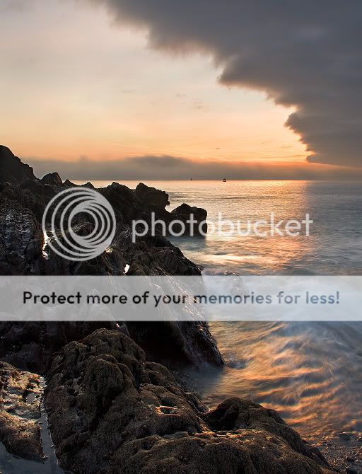
MemberThis was my very first sunrise outing last weekend and I got lucky with some interesting clouds and light.
Taken at Church Bay, Crosshaven, Cork, with a view of Roches Point Lighthouse after the clouds started to clear.
C&C welcome,
Cheers, Conal
carrigman
Participanteshortie
ParticipantSurprised these havn’t more comments, really like both.
No.1 is great it’s like the clouds and waves are at odds, good contrast.I think No. 2 could have benefitted from a slightly longer exposure to remove the ripples.
dar_d
ParticipantI really like them both…Think they could be even better if you were able to bring more colr into the sky…Im crap with photoshop so dont actually know how to do that!
RaV
Member^ thanks, there colours are a bit tame but you might be right :)
eshortie I agree about the long exposure, unfortunately i a bit surprised by my luck and was just trying to keep things simple so i didnt make too many mistakes :)
Alan Rossiter
ParticipantYeah, two well presented shots. Nice colour, sharpness and features.
But there’s a very interesting crop in the second one. If you scroll the image so that all you see is the image above the rocks it beings the head into feature and really marries the cloud and the head. In reality you’d want to go half way up this patch of sea but that tends to make the cloud dominant which doesn’t work. I think the rocks make the image just a little busy and still works none-the-less.
Alan
Deebo
ParticipantLovely shots and I was thinking the same as Alan before I read his post.
Second one could be made far better with a simple crop to remove the messy foreground rocks.
Deeseanmcfoto
MemberI love that you’ve both the sun and detail in the shadows in #2. The tones are quite mute as noted by someone else. Where they like that?
I know we all love saturation in our sunsets, but they can often be quite mute.MadeleineCalaidoWeber
ParticipantRaV
Memberthanks everyone! :)
seanmcfoto colour wise, the 2nd one is pretty much spot on. which is what i was aiming for on these.
And your right about the saturation, its a fairly personal thing ;) so was trying to get a balance.seanmcfoto
MemberI get tired of over saturated images and often try and strike that balance (I fail plenty of times!). I do like #2 a lot.
The line of cloud in #1 makes it for me.
You must be logged in to reply to this topic.


