Homepage › Forums › Photo Critique › Landscape › Drombeg Stone Circle, Co. Cork under moonlight. Please vote!
- This topic is empty.
Drombeg Stone Circle, Co. Cork under moonlight. Please vote!
-
CianMcLiam
ParticipantHi folks, I’m working on the final selection of photos for a book I’m hoping to finish by xmas and since Drombeg is one of Irelands most famous bronze age stone circles (approx 3-4,000 years old) I can’t possibly leave it out.
So, I got thinking about ways to include it without one of the cliche shots that appear by the bucket load. So I decided a moonlight series opf photos might work well, selecting the best from the results below.
Well, I’m fairly happy with the results but my wife doesn’t like the ones which have obvious use of flash, I’m torn now between the more natural moonlight look and the added spice of flash and shadows.I’ll only feature one, maybe two at the most so would greatly appreciate your honest opinion on which among these best describes the spirit of the place:
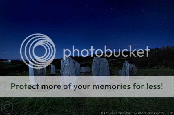
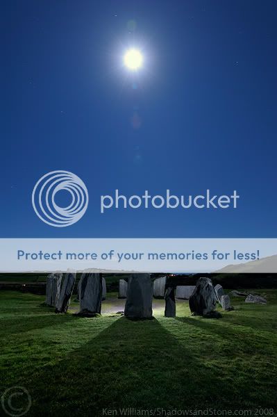
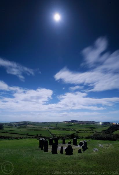
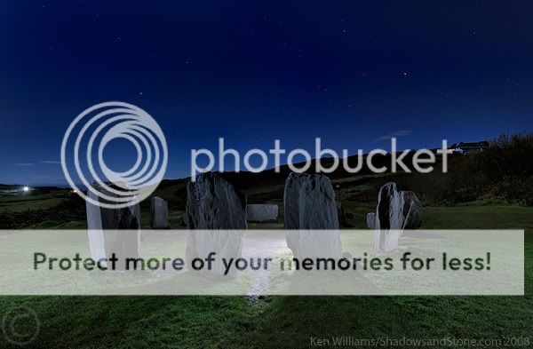
Photo 1
Photo 2
Photo 3
Photo 4
Photo 5
Thanks for looking and voting!
Ken
MadeleineCalaidoWeber
ParticipantKen great great job! 1,2,5. 5 is the best, 4 the weakest. Good luck with the book.
How did you post this voting area?
Your website doesn’t work!!!!CianMcLiam
ParticipantThanks Madeleine, only just realised my site name has expired when a friend mailed a few days ago. Hopefully it will be back in action in a few days!
No. 4 is the weakest in my opinion also but included it as it’s the one my wife did like! She thinks the ones with flash look like computer graphics rather than photos :) Night photography seems to work better for me when it’s close subjects, expansive landscapes just look like underexposed daytime shots with dodgy white balance.
When you post here there should be an ‘Add a Poll’ option just above the submit button? Just keep adding options once you’ve typed your message in the main box above.
Martin
ParticipantKen im going to be honest and say I dont like any of them. I really think they look computer generated or something, they just don’t look natural to me. I just don’t get anything from them, there’s no mood and they dont strike any chord in me…. Sorry for sounding negative but just wanted to be honest
Martin
SteveD
ParticipantI think number 4 is the strongest Cian, and most suitable for the theme. I would maybe clone out those 2 lights in the distance, on the right hand side.
wesleylaw
MemberBest describes the spirit of the place.. Thats a big question. Its between 4 and 5 for me.
no1 the stones have a blue cast.
no2 top of stones is practically on the horizon line.
no3 i like the implied association where the moon could be illuminating the stones but the stones are not really composed like a receptacle. Maybe a crop off the bottom of that one.
no4. There they are in their environment. lights are off, closed for the evening, There is a bit of life in the distance. I suppose there is something vaguely powerful about this but not in a nice way. Are the stones sucking the life from the environment? turning day into night? If there was a mysterious glow on the stones in this shot then I could relate that to the moon which gives them life and there is a mysterious connection.
no5 If the light source was a bit softer then i wouldnt know immediately that there was something behind the stone. There is a nice doorway here. I like the shadow and light in the foreground. There is a feeling of exploring with a torch. Real life is in the background with the house on one side and the car on the other.
No. 5 for me… Spirit isnt as good as mystery.
The Cambodians thought Anghkor Wat was made by aliens untill some French guy told them they built it themselves.
Good luck with the book.
CianMcLiam
ParticipantThanks for the comments and votes.
Martin: Cheers, posted them here for some honest opinions so appreciate your honesty, that’s exactly what my wife thought was wrong with them! Will go through the RAW files again to see if there’s anything that has a more natural feel.
Steve: Thought about cloning out the lights but this one in particular looks like an underexposed day shot with a blue cast so the lights are a hint that it’s actually near midnight!
wesleylaw: Thanks for your thoughts on these, I’m liking no 5 more and more. I just bought a new LCD monitor with wide gamut and am having problems calibrating the colours properly and even when it’s calibrated different applications and internet browsers show colours differently! Thought this would end my colour woes but seems to have added to them! Hence there might be a colour cast to some though the blue is intentional as it was very blue under the full moon that night.
Any other comments, suggestions?
Seoirse
MemberNumber 4 is my preference.
Seems very natural and uncontrived. Would look great on a calendar.
Seoirse.
Daky
ParticipantI prefer 4 too because in the others the stones are level with the mountains in the background, which I find to be a distraction. They should either be above the mountains or below them (as in 4) but not level.
jessthespringer
ParticipantI would agree with Martin. They look a little like underexposed daylight pictures, not really what I think of when I think of night photography. Am also wondering why you used flash? I mean, I think I understand to a certain extent but moonlight can create some pretty cool shadows… Is flash not kind of missing the point?
Sorry if this sounds blunt, bit I do appreciate honest comments when they come my way so I hope this helps.
Sinead.
CianMcLiam
ParticipantNot at all Sinead, as I said that’s the kind of feedback I’m after. The moon was at almost noon so the shadows were very short as can be seen in pic 4, I was after nice long shadows but clouds hid the moon for most of the night. I’m going to retry with no moon to get a star-filled sky which might look more night-like. There’s some great night shots in the recent edition of National Geographic taken with a Nikon D3 at iso3200 so there’s no star trails, that’s what I aim for too as I dont really like medium to short trails, its very long or none for me which is why I usually wait for full moon.
plainoldme
MemberCant even say why but i much prefer number one. Like I said, I dont have an explanation its just more appealing to me…
JMac-2006
ParticipantNo.5 is the best of the bunch – pity about the overpowering torch, flashlight in centre – if you had restricted the power of the light it would be better, as there is good play with light shadow there.
No 4 but with stars and no moon could be a good image too.Well worth another go if you get another clear night :( – pick one or two compositions only and work them to get the best out of them.
ps. What was your exposure times like on these?
shutterbug
ParticipantMy first choice was 4, purely because it included the surrounding area,
I have never been there, but thats the one I am drawn to.!MartinOC
ParticipantI went for number 4. I decided this before I read the other comments so I was surprised that there is such a variance of opinion on that photo.
The others look a bit too artificial, and I do like the communciation between the heavens and the circle in #4, and the context of the landscape.Martin
You must be logged in to reply to this topic.


