Homepage › Forums › Photo Critique › People › Elena
- This topic is empty.
Elena
-
Thorsten
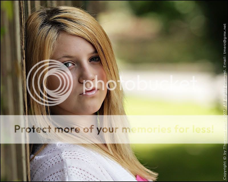
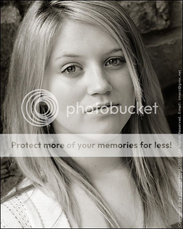
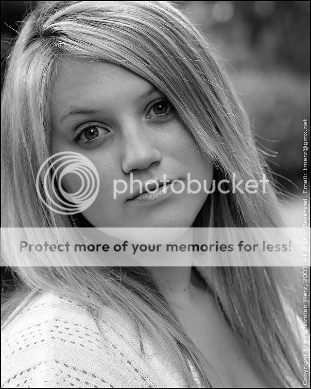
MemberElena’s first time in front of the camera during a short 30 minute shoot on Saturday.
1.
2.
3.
JohnnyMcMillan
ParticipantHeya,
3 things seem to stick out for me in these photos. Firstly (well this is just more my preference) your two b/w conversions have two complete different tones…any reason for that? Secondly your watermark is far to distracting in the photos, and just from the models stance her head is leaning against something or at an angle in all three?
Not Pete the bloke
ParticipantFirst one stands out to me Thorsten. Beautifully sharp where it needs to be and it has 135 f2 written all over it…? Great colours.
Thorsten
MemberJohnnyMcMillan wrote:
Heya,
3 things seem to stick out for me in these photos.
JohnnyMcMillan wrote:
Firstly (well this is just more my preference) your two b/w conversions have two complete different tones…any reason for that?
Yes, there is.
JohnnyMcMillan wrote:
Secondly your watermark is far to distracting in the photos
You mean too distracting? That depends…
JohnnyMcMillan wrote:
and just from the models stance her head is leaning against something or at an angle in all three?
Yep!
Thorsten
Memberbrandyman wrote:
Beautifully sharp where it needs to be and it has 135 f2 written all over it…?
Well spotted – I need to get that lens out of the bag more!
jb7
ParticipantI think the first is the most successful-
I’m not sure I would have shown no.3 at all though-
the model’s look is a little ambiguous,
but perhaps indicates a little impatience with the photographer-
or at least that’s how I would interpret it if I had been taking it-But obviously I’m just making it up,
and am probably completely wrong again-All the photo bits great as usual,
though I’d lose the tiny bit of pink-j
Thorsten
Memberjb7 wrote:
I think the first is the most successful-
I’m not sure I would have shown no.3 at all though-
the model’s look is a little ambiguous,
but perhaps indicates a little impatience with the photographer-
or at least that’s how I would interpret it if I had been taking it-But obviously I’m just making it up,
and am probably completely wrong again-Interesting observation and not too far off the mark I’d say. The first image posted was literally the first image I shot and when Elena saw it she didn’t like it because she felt it showed “attitude” (in the negative sense of the term). She spent the remainder of the shoot trying to avoid “attitude” and this presented somewhat if a challenge for me as I didn’t want her to be overly self-conscious. The last shot was about 3-4 shots away from the last frame I took and one of a series where I was trying to get a different expression out of her. While it’s not the best expression there was something about it I liked which is why it appears here.
jb7 wrote:
All the photo bits great as usual,
though I’d lose the tiny bit of pink-j
Yes, agreed. I wanted the crop the way it is, which left me with the option of cloning it out or changing the colour from pink to something more subdued. Laziness on my part however meant that it stayed pink for now :(
Appreciate the constructive feedback.
Frankie
ParticipantHi Thor, Really don’t like the model’s pose. It does nothing for her and I can see why she tried to avoid it in the other shots! The thing she is leaning on you have blurred most of it out but left on tiny stip near her head. What does it look like with that in focus? As you can see I am making up the terminology! Has this girl been modelling long out of interest?
Ali
ParticipantReally like the second one Thor – expression is lovely and eyes are wow. I think there’s a certain warmth about the tone i really like – definitely adds to the mood. Great range of expressions, first almost has a rebellious streak about it :) second is almost a knowing look and third is extremely innocent. I prefer the lighting conditions in the second, i think the first and third just don’t seem to pop out at me, maybe a bit more fill?
Rob
MemberSecond shot for me too Thorsten. Gotta love those eyes, particularly
electrifying in that shot. Really well balanced image right across the tonal
range, and just perfect contrastwise.Rob.
RavenAsh
MemberJay King
ParticipantI seem to be slightly distracted and drawn to the mascara on the model… mainly the unevenness on her lower right eyelid
seanmcfoto
MemberHi Thorsten!
I’m sure I’ve seen slightly different versions of these somewhere else. I like the ‘attitude’ in the first one myself. I do find her left eye a little dark (relative to this side of her face), maybe a small bit too much in shadow from the hair? The highlight in the OOF area to the back is a little distracting, but the Bokeh is astounding!
I like the second one and I’d like to see even more shadow on the fill side. The third one will help me explain my feelings. This one shot straight on shows the roundness of the face, which makes it look heavier than the first one. Short lighting it and using shadow to slim the face would really flatter her. She is very pretty. Exposurewise I think all of these images are spot on with a full range of tones.
As others have mentioned the watermark, I have to say I didn’t even notice it until I saw the post. I was too engaged by the images.If I was doing a little more post on the images, I would make a feathered selection around the eye in #1 and lighten it. Maybe darken down the left side of the face in #2 and darken the area to the side of the cheeks, below the cheek bones to slim the face (as a woman would with make up).
As always Thorsten, these are just opinions and not to be taken as criticism. These images are well above average and only need little things to take them that step further.
Thorsten
MemberFrankie wrote:
Hi Thor, Really don’t like the model’s pose. It does nothing for her and I can see why she tried to avoid it in the other shots! The thing she is leaning on you have blurred most of it out but left on tiny stip near her head. What does it look like with that in focus? As you can see I am making up the terminology! Has this girl been modelling long out of interest?
Frankie, thanks for the feedback. It’s great to get feedback like this from models as well as photographers, so keep it up! To answer your last question, no Elena has not been modeling long. In fact this was her first time modelling and our first time meeting too. I generally prefer to get to know my subjects a little before a shoot, either by meeting them in advance or more often than not, through email correspondence. I had no prior contact with Elena. This shoot was part shoot for me and part coaching session for another photographer (she was the person that actually “dragged” Elena along).
Ali wrote:
Really like the second one Thor – expression is lovely and eyes are wow. I think there’s a certain warmth about the tone i really like – definitely adds to the mood. Great range of expressions, first almost has a rebellious streak about it Smile second is almost a knowing look and third is extremely innocent. I prefer the lighting conditions in the second, i think the first and third just don’t seem to pop out at me, maybe a bit more fill?
Thanks Ali. That 2nd image was converted using myu favoured mono conversion technique, Gradient Map. I find it allows for very control of toning. The third image was converted using a plugin which I’m still experimenting with and am somewhat undecided about. The only fill used was a reflector. I deliberately avoided the use of flash because I wanted to demonstrate to my “student” that you didn’t need a whole ton of gear to get good shots; I also didn’t want the model to feel intimidated by extra gear being poked in her face :-)
Rob wrote:
Second shot for me too Thorsten. Gotta love those eyes, particularly
electrifying in that shot. Really well balanced image right across the tonal
range, and just perfect contrastwise.Thanks Rob – appreciate the feedback.
Raven Ash wrote:
Three great shots Thorsten.
The Second shot stands out for me.Thanks. Seems like the second image is fast becoming a favourite.
Jay King wrote:
I seem to be slightly distracted and drawn to the mascara on the model… mainly the unevenness on her lower right eyelid
Hmmm, are you sure that’s mascara you’re seeing? She didn’t use a lot of makeup (she doesn’t need to, IMHO). She’s only 18 and at that age I think makeup is only needed for dramatic purposes or when going out :-) I’m going to have to take another look at that when I get home this evening (not such a good monitor here at work). It never ceases to amaze me what different things people spot! But that’s a good thing – I still haven’t learned the art of looking at *everything* in the viewfinder before I press the shutter – but I’m getting there.
seanmcfoto wrote:
Hi Thorsten!
I’m sure I’ve seen slightly different versions of these somewhere else. I like the ‘attitude’ in the first one myself. I do find her left eye a little dark (relative to this side of her face), maybe a small bit too much in shadow from the hair? The highlight in the OOF area to the back is a little distracting, but the Bokeh is astounding!
I like the second one and I’d like to see even more shadow on the fill side. The third one will help me explain my feelings. This one shot straight on shows the roundness of the face, which makes it look heavier than the first one. Short lighting it and using shadow to slim the face would really flatter her. She is very pretty. Exposurewise I think all of these images are spot on with a full range of tones.
As others have mentioned the watermark, I have to say I didn’t even notice it until I saw the post. I was too engaged by the images.If I was doing a little more post on the images, I would make a feathered selection around the eye in #1 and lighten it. Maybe darken down the left side of the face in #2 and darken the area to the side of the cheeks, below the cheek bones to slim the face (as a woman would with make up).
As always Thorsten, these are just opinions and not to be taken as criticism. These images are well above average and only need little things to take them that step further.
Thanks Sean – useful and constructive feedback as ever! You made me smile when you said “If I was doing a little more post on the images…” As it happens, I wasn’t going to do anything at all with them! I shot on Saturday afternoon and because of time pressures, I was simply going to post them as they came out of the camera. But I felt Elena deserved to see what the images would look like with a little bit of work at least. Personally I’m still striving to get to a stage where my images require little or no post processing. Ultimately, the only way to do that is complete mastery of lighting and makeup. I’ve still got quite a way to go but it’s an interesting journey nevertheless. Oh, and the only difference on the different version is the size 600 pixels compared to 800 pixels here!
stasber
MemberThorsten wrote:
I wanted to demonstrate to my “student” that you didn’t need a whole ton of gear to get good shots
So does your “student” also have a 135mm f2 L lens? “See, you don’t need a whole ton of gear, it just needs to cost a whole ton” :lol: :lol:
Made me chuckle Thorsten. Sorry – nothing more constructive to add besides! Overall I like all three and have learned much from people’s responses to them. Will be digging into a model shoot myself in a couple of weeks time so currently foraging for ideas & info.
You must be logged in to reply to this topic.


