Homepage › Forums › Photo Critique › People › First model shoot . . . comments please !
- This topic is empty.
First model shoot . . . comments please !
-
aoluain
ParticipantHad a chance to shoot a model friend yesterday.
1st time doing this and was kind of winging it for the first hour, but got into it
and really enjoyed it.I love the style where the sky is really blown with a kind of glow through the pic.
I know there are possibly some elementary mistakes made with these 3 but im not
sure either.C&C welcome, no needed !
justaguy
ParticipantWhoo alan You going to introduce???
Good pictures no doubt.
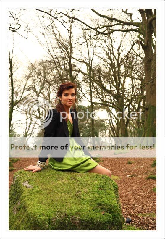
The only point of critique i would have is that the colour of her dress blends in to much with the surroundings.
Esspecially on the first one.
But otherwise. You’re a naturalTiny
Membernice shots….. really…
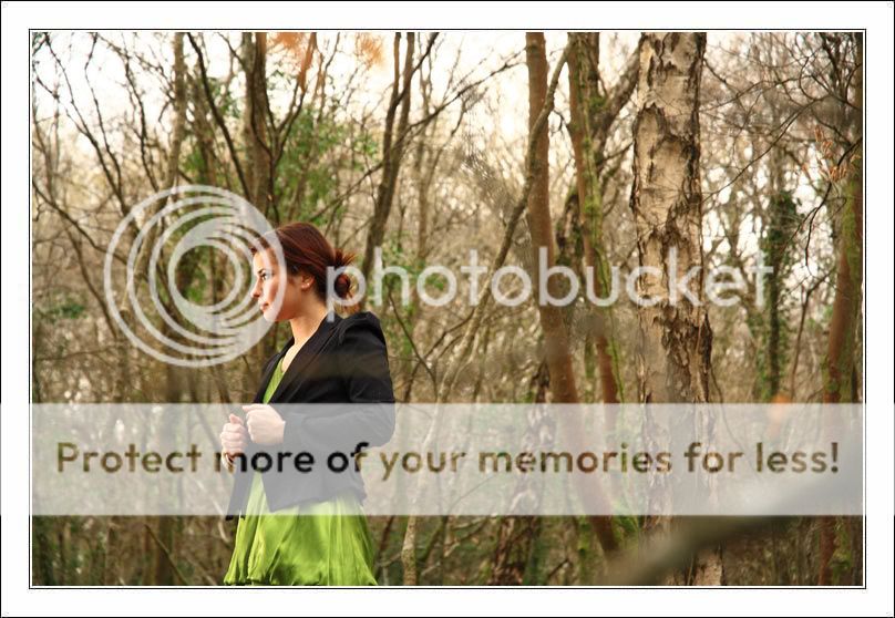
but ( there is always a but ) .. in the first shot.. she’ got a lot of space.. maybe consider cropping a bit tighter… the second shot, is my fav, love the way the model is lit up.. only the branch.. the blurry branch between her and the lens.. its annoying.. ( only a personal opinion though )
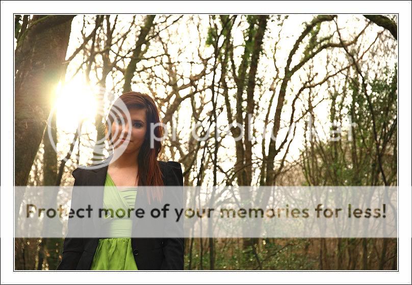
the third shot has the sun right beside the models head.. i’d have moved a bit if i could have..
but for your first attempt.. i would be happy…. hope i will be as happy even……
b318isp
ParticipantCompostion is good, but with a relatively complex b/g I think the model should be brighter and the DoF shallower. That said, you’ve done very well with the exposures, paticularily shooting into the sun on the third.
Cookster
ParticipantI like number 2. The dress looks great and the side lighting works well – a bit hot maybe.
1st has a bit of a snapshot feel to it. Model doesn’t seem to be strongly posed or featured in the shot.
3rd the glare of the sun is bit distracting.
Definitely nice ideas going on though.
Sean
deeorgan
Participantaoluain
ParticipantThanks everyone,
I have more images I might submit from the day.
Peter, Thanks, yes I see what you mean about the greens in the first.
Tiny, The first shot I know was going to be iffy, I knew from reading on this
section to ‘get in close’ and ‘crop tight’. but I wanted to give a feeling of space
and showing more of the surroundings while still focusing on Alex.The third, I wanted to get that summer glow with the light beaming into the image,
granted I should have maybe positioned the sun behind the tree but still have the effect.In the secont one I deliberatly positioned the branch on front of Alex, I wanted to give
a feel of her being more in the forest, dont know yet whether I will change it?Brendan, Thanks also. I see what you mean about the complex backround the minimum
F stop I could use was 3.5! Later in the shoot I was using a 135mm tele 3.5 also
but that produced a better Bokeh.Cookster, Thanks for the feedback, taken on board! Hot?
Dee, Thanks a mill, yea #2 is the better of the 3!
Again thanks all, really appreciate the feedback.
Alan
Cookster
ParticipantBy hot I mean that the lighting from the side is a bit bright on Alex skin
Sean
aoluain
ParticipantCookster wrote:
By hot I mean that the lighting from the side is a bit bright on Alex skin
Sean
Ah ok ! Thanks.
GrahamB
ParticipantThe composition is great in all the shots mate but the girl does get a little lost in the background.
Still for a first outing really great work…..aoluain
ParticipantThanks a mill Graham, All the feedback is really much appreciated
and will be used again!
You must be logged in to reply to this topic.


