Homepage › Forums › Photo Critique › Landscape › Giant’s Causeway – The Night of Perfect Light!
- This topic is empty.
Giant’s Causeway – The Night of Perfect Light!
-
richiehatch
MemberI’d be happy with any of them but particular No.1…! Lovely light and colours… the people really give it scale too…! Being picky moaner…. that bloody dust bunny in the top of 2,3 and 5… god I hate dust… the 5D is like a vacuum for it…! Arrrrggghhh…!
Richie
Roberto
MemberSteveD
ParticipantThank you to everyone who has taken the time to comment. It is a series of shots I am very pleased with. In fact, on Thursday I will be going back to the RAW files to see what I can do. These were processed very quickly ( about 10mins each), so if I spend a bit more time on removing distortions, blending exposures etc the second and third might look a bit better.
amcinroy wrote:
We must get out again if it creates such inspiration !!
Yep! And anyone else is welcome to join us!
earthairfire wrote:
Super sharp, and brilliantly executed.
Thanks for the detailed feedback!! I’m glad you felt I captured the Causeway well.
Valentia wrote:
The first is my favourite. How did you get those people to stay still for 20s?
Superglue!!! :lol: But seriously, they were standing there watching the sunset and enjoying the moment. They didn’t move much.
Tara wrote:
Am heading up that direction on Thursday and can’t wait!
I might be up again if the weather is good! Don’t forget to say hello if you see me. I will be the one risking his life beside the crashing waves!!
richiehatch wrote:
I’d be happy with any of them but particular No.1…! Lovely light and colours… the people really give it scale too…! Being picky moaner…. that bloody dust bunny in the top of 2,3 and 5… god I hate dust… the 5D is like a vacuum for it…! Arrrrggghhh…!
Richie
Would you believe I didn’t see them until you mentioned it!!?
SteveD
ParticipantOK, so I have reworked one of these images and would be keen to hear what you all think! Have I gone too far?
Before:
After:
earthairfire
ParticipantYou’ll always get the cardigan wearing old man brigade (no offence to any old men on here who wear cardigans :lol:) who say “PS is the downfall of photography” and that “digital manipulation is cheating”, as they load up another roll of velvia :lol:
Personally i think you’ve done a great of it, really nicely manipulated. The light on those rocks just looks divine.
Tim
Roberto
MemberRob
MemberSteve
Excellent reworking of the image, fabulous warm colours and still so sharp. Some of the rock detail seems to have been lost though just where the water begins to mist (or else it’s just this screen I’m using) but that doesn’t take away from the overall effect. Love it.
Rob.
Brian_C
ParticipantSteve I love the second one, lovel warn feel to it, I like more than the first.
A word on the first, is it me or does the horizon barrel or pull toward the tip of the Causeway on the right, but it doesn’t on the reworked ‘Red’ image. Just an observation, they’re both quality photo’s.
davenewt
ParticipantBrian_C wrote:
is it me or does the horizon barrel or pull toward the tip of the Causeway on the right, but it doesn’t on the reworked ‘Red’ image
Interesting… I can see that too. Is this an optical illusion on the grey version or…?
D.
SteveD
ParticipantThanks guys, and I very much agree with Tim about the rolls of Velvia! And it seems you don’t miss anything, there is indeed barrel distortion in the first, but I removed this for the new version! Can’t believe you spotted that!!!!
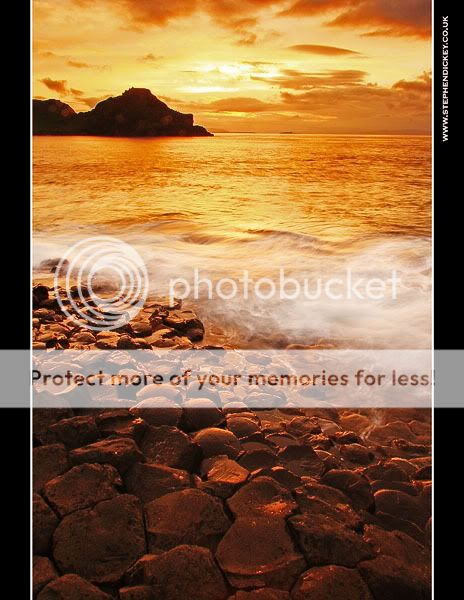
Here is another from that night, I think it represents the Golden Hour very well……..
v4honda
Memberirishlens
ParticipantStephen – 1 and 4 in your original set and the replacement are fantastic shots.
I like the postprocessing effect a few posts back where you added a kind of golden color cast.
I agree with the previous critique about the most recent retouching sample that you possibly
have gone overboard with the saturation and colour tweaking in that one.Very nice photos. What time of day did you take them at ?
–Ian
You must be logged in to reply to this topic.


