Homepage › Forums › Photo Critique › Landscape › Giants Causeway Trip
- This topic is empty.
Giants Causeway Trip
-
Dan
ParticipantHi
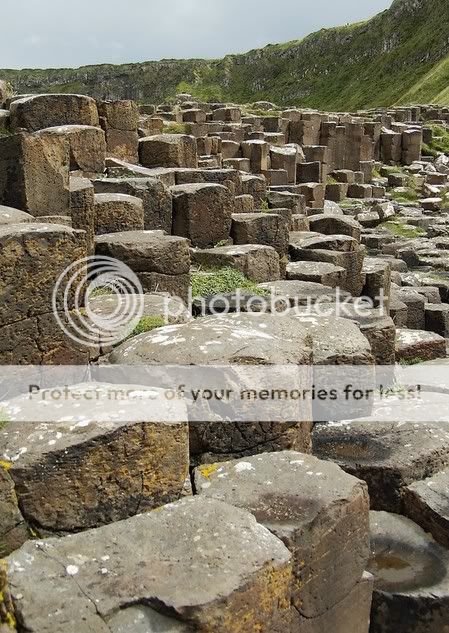
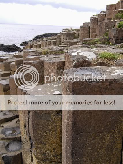
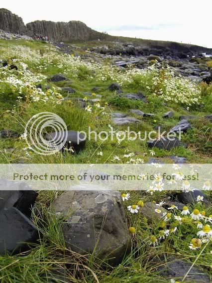
Took a week of work and did a bit of touring, went to the giants causeways on monday, so heres a few snaps
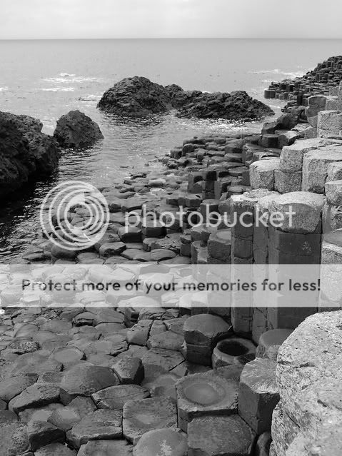
after seein all Marks b&w’s i decided to have a go!worst thing about this place is that there is people everywhere,very hard to get shots without some buger getting in the way you wil see this in 1 or 2 shots
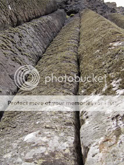
And some colour
Dan
ciaran
ParticipantJust WAY TOO MANY shots to critique. If you’re just looking to share shots with people, perhaps instead post a link to a gallery where the shots are stored? For critique, pick one of your favourite or one which you struggled to take and leave that one.
ed
ParticipantMight be alot of photos, but still worth making some comments I think.
First colour shot: Might be better to make it more abstract by cropping the top.
I like it anyhow, good leading lines, dynamicAlso think the second colour is a good one, pity the sky’s are a bit flat.
Third colour: The horizon is wonky ;)
Last colour photo: I love the flowers on the green grass very nice. Pity the sky is blown out.
Maybe with photoshop you can rescue the sky thoughOn the b+w, most would have been helped by a better sky, but you have to take what comes your way :)
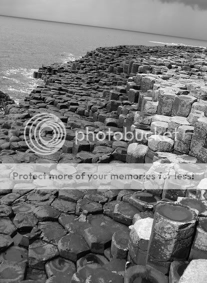
The second b+w has got a great sky imho, bit blown out to the right though, but still the clouds are nice.
Nice conversation too.Ed
Mick451
ParticipantI’ll just comment on the ones I like ;)
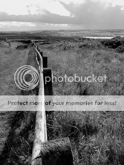
The first one (LongWalknorthcoast.jpg) could do with a bit more sky and a bit less bottom, especially where the fencepost is out of focus. The sky looks interesting enough to warrant a bit more room, though if it was flat overcast I’d agree with Ed. I like the way the fence leads you into the distance, and that when you get there there’s a lake to draw your focus too. A quibble might be that the fence doesn’t lead you directly to the lake and your eye has to just across to it.
Colour one third from the bottom (PIC02434.jpg) I really like.
The rocks lead you into the photo in a curve going one way, then the grassy embankment leads you back down again so you eye has a path to follow around the whole photo. It’s just a good visual structure. This is the most appealing of all the shots to me, tells me most about the place as well as showing me some up close bits.Rob
Member8) I must agree just too many pics in one post to be able to comment fairly, though I’ll say that the second one caught my eye with that sharp horizon fading from dark on the left to light on the right. You could almost crop the foreground out of this picture completely, right up the rocky headland jutting out on the right, and still maintain the best of this picture. 8)
Dan
ParticipantThanks for the comms, I just posted them all up cause it was a day out, the first one is my fav, i wil give that second one a crop and see how it turns out, once i learn how to use photoshop ill try and improve a few!
You must be logged in to reply to this topic.


