Homepage › Forums › Photo Critique › Architecture / Urban Landscapes / Streetscapes › Graffiti in Dublin
- This topic is empty.
Graffiti in Dublin
-
miniscott
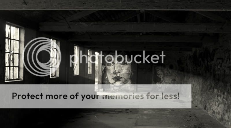
ParticipantTaken in the Ammunition Fort in the Phoenix Park.
Critique and Comments would be much appreciated.
Thanks in advance
jb7
ParticipantHello miniscott-
I’ve got to admit to being slightly disappointed by this-
I’m sure there is detail hiding in the shadows, but it’s all gone to black-
I think more texture would be good, but I’d prefer to see it than imagine it…Judging by how you’ve framed it, it’s as much about the interior as the graffiti-
I like the light streaming in, and it’s a good find-
I wasn’t aware that building was open, must take a look sometime myself-joseph
aoluain
ParticipantI really like this,
Well spotted.
The lighting is brilliant, it depicts a very dusty dank place with
the light beaming through the windows picking up the dust particals.The graffiti on the far wall is what makes the pic.
Although there is a bit of detail to be seen in the shadows I feel
I have to really work to see that, Maybe just lightening the shadows
a tad just to reveal some more detail would improve the atmosphere.Nice one
Alan
miniscott
ParticipantThanks for the kind comments and critique Joseph and Alan.
I will have a look at brightening up the shadows to reveal more detail and I might also add a little more contrast in these areas.
Regards
Richieb318isp
ParticipantHow did you get in!!! I like this picture as it is. The photo is not about the shadows – and I’d think that lifting them would only detract from light streaming and the far wall.
You must be logged in to reply to this topic.


