Homepage › Forums › Photo Critique › People › Guess who?
- This topic is empty.
Guess who?
-
Thorsten
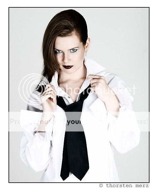
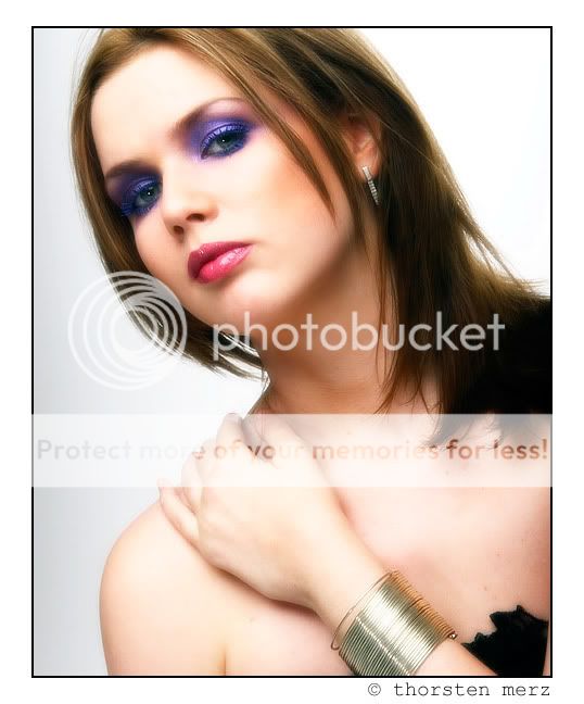
MemberSeeing as the makeup was OTT, I thought I may as well go OTT on the PP too :D Comments, anyone?
1.
2.
earthairfire
ParticipantTotally overcooked, but I like that!
Like them both, but looks like the top one’s shirts highlights may be a bit blown?
Nice PS work. You’ll probably get the cardigan crew telling you it’s disgraceful, and that photoshop should be banned, and then go and shoot in blissful velvia filled ignorance, but you can’t please them all…
Tim
Thorsten
Memberearthairfire wrote:
Totally overcooked, but I like that!
Yep – totally deliberate too!
earthairfire wrote:
Like them both, but looks like the top one’s shirts highlights may be a bit blown?
Borderline blown – believe it or not, in the original files, there is still detail there but it’s hovering at around the 253 mark! Of course in the JPG conversion and compression that’s now gone!
earthairfire wrote:
Nice PS work. You’ll probably get the cardigan crew telling you it’s disgraceful, and that photoshop should be banned, and then go and shoot in blissful velvia filled ignorance, but you can’t please them all…
Tim
Ha ha.
terry
MemberHi Thornsten,
I really like what you’ve done with the first shot, like you say the make up was OTT but the PP seems to have highlighted it all in the right places. It has a very sculptured look about it. As for N0.2 God I wish I could get that peachy glow and texture to my skin.
I like them both and whats photoshop there for only to be played with. (SOMETIMES)
Terry
wavydave
MemberHi Thorsten,
I like no 2 the most. There is just a slivver of her arm in the bottom right that should be cropped out though. Otherwise they are both great shots and I like the p&P.
earthairfire
Participantwavydave wrote:
HThere is just a sliver of her arm in the bottom right that should be cropped out
Well spotted!!
Tim
Bethscott
ParticipantHey you guys I love the second image, make-up OTT?! It was supposed to be like that and I love the eye make-up in the second one. We weren’t going for the soft images that are seen everywhere LOL I think it is dramatic and I need images like this so am very happy well done Thor! (And the make-up artist too of course!). Top one – Hmmm not sure I think my skin looks kind of grey in it. I suppose that is how you have processed it to tone down the make-up but anyway you could show us what it looks like warmed up a bit? Dont mind me if i get phrases wrong I sooo don’t know my terms and technical aspect! I only know what a camera and reflector looks like :oops: :lol:
Well done!
Thorsten
MemberAlways good to have positive feedback from the subject :!:
To be perfectly honest, I love the eye make-up in the second one too! I suppose what didn’t really appeal to me was the heavy lipstick/lip-gloss/whatever you call it, of the earlier sessions. The first image you see here actually tried to accentuate that by making the overall image more monochromatic, by essentially taking out a lot of the colour – that’s why your skin looks grey on it. Not sure if you’re familiar with a technique used in the TV series “Band of Brothers” or the movie “Saving Private Ryan”. That’s basically the effect I was after. I’ll put up a full colour one as well as a diffuse filtered one (like the second shot here) later tonight and you can decide for yourself which you prefer :D (Might also try a cross-processed one while I’m at it).
Thanks for the feedback.
freshphoto
Participantlove the second one thor get in a lil closer maybe and loose the black bottom right hand corner
Thorsten
Memberfreshphoto wrote:
love the second one thor get in a lil closer maybe and loose the black bottom right hand corner
Will give that a try, thanks. Didn’t want to loose the fab bracelet thoug, which is the reason the arm is where it is in the first place :) Might try and clone it out.
Beast
ParticipantGood job Thorsten!
You’re giving me ideas :DBeth, I’ll be going through my images from the shoot over the weekend and I’ll mail some to you once I’m happy with them.
KPM
ParticipantHi Thorsten,
love both shots, but the second one stands out for me. I won’t ask you how you achieved that look, but its quite like what I’ve been experimenting with on a couple of shots from my first (and only) model shoot. I might be brave and post one of my shots at some stage in the near future.
The only thing which takes away from the first shot, for me, is the two catchlights in the eyes. Personally I prefer just the one.
I think that these, along with some of your other shots of Beth are superb. I suppose it also helps to have such a beautiful model to work with.
Regards
Kevin
Rob
MemberThorsten, it’s got to be number one for me. What a look. So sultry. And the pp
is fantastic, overcooked or not.Rob.
ciaran
ParticipantMaybe you should shoot in the studio more :) These are streets ahead of the shot you posted with the roses across Beths face. I really like them both, over cooked or not.
Not Pete the bloke
ParticipantIt’s the first one for me Thorsten, it just has that little indefinable quality which makes you want to come back and look at it again. The eye contact, the pose, the PP, it rocks as far as I’m concerned.
It’s another 10/10 from me!
You must be logged in to reply to this topic.


