Homepage › Forums › Photo Critique › People › Homeless
- This topic is empty.
Homeless
-
Jay King
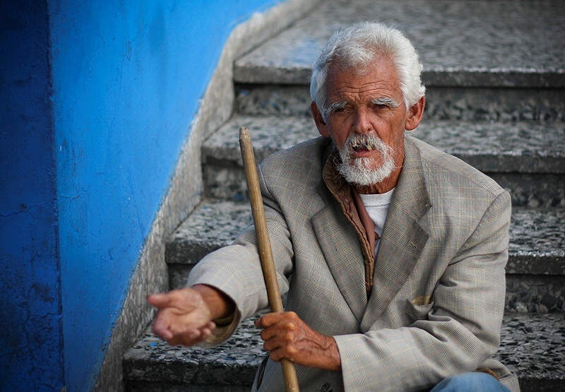
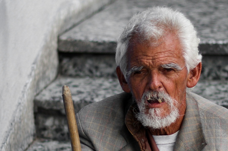
ParticipantSame shot just not sure which I prefer… the full frame or just the close up? I like the full frame for his gesture etc, but there is more to see in his face up close (which I over cooked a bit I think (and also removed the blue from the wall as it was reflecting in his hair too!))
I don’t know much about photographing people… so any C&C or thoughts is welcome!
Cheers
GrahamB
ParticipantTo be honest I think the first shot works a lot better.
There is a nice contrast between the vibrancy of the wall and
the depression of the overall scene.
The close up lacks a puch in my book.
A very good shot though.Sgt_Major
Memberagree 100%
The 1st shot is miles better.
I’d crop a bit off the left, to remove the corner, pity the hand is out of focus, but not much you can do about that.
GrahamB
ParticipantYeah cropping to the left will help a little.
I kinda like that the hand is out of focus. Shows movement towards the
photographer and engages the viewer a little more.
Still though that’s just me.plainoldme
MemberRob
MemberHmmm, why am I seeing more in the second?
I think it’s because the high viewpoint isn’t as pronounced
or obvious in the close shot, and the gesture is somewhat lost
because of the blur.It might be an idea to crop to square leaving him central in the
frame. It looks as though you could get more detail too without
oversharpening. It might also be a good candidate for conversion.Seeing as you allow edits, this is just a very quick (3 minute) version
of what I’m talking about. Hope you don’t mind…Processing:
Duplicate layer>
High pass filter, 50 pixels, set to soft light, opacity 40%>
Unsharp mask (on high pass filter layer) 5 pixels>
Solid colour layer (pure black), set to colour>
Slight dodging of the eyes on original layer>
Flatten image…Rob.
Jay King
ParticipantThanks for the comments :) Seems to be a mixed preference… especially regarding the hand/gesture…
Graham – I think the first is better too, now that I compare again… the scene, gesture, colour. I’m sure I could get more out of the tight crop though, not sure how to process portraits etc…
Sgt_Major – I quite like that the hand is out of focus… to me it’s like he’s reaching out to you and gives it depth…
plainoldme – agreed, I quite like the gesture too :)
Rob – Thanks for the edit, was more than happy to see it. I don’t know how to post process portraits so seeing the edit and how it was done was a great help. I tried a conversion myself but couldn’t get it looking right, always lost too much detail, so might give it another go now. Interesting you mentioned the high viewpoint, I purposely didn’t get down low for this – just because he was sitting down and wanted to show the view that most people have as they walk by and ignore him…
He was a nice guy, didn’t say anything but when I gave him some change he stood up and posed for another shot!
Thanks again for the comments :)
Little Lady
ParticipantJay King
ParticipantLittle Lady wrote:
The second is a great shot.
Mary
Thanks Mary, they’re actually the same shot… just a tighter crop on the second :)
Expresbro
ParticipantI like the original Jay… and I think Rob’s edit is great compositionally, but I still feel it’s a little too noisy, which will be a problem when cropping that tight from a larger frame, unless I suppose you’re using a top end camera with a huge pixel rate.
If you’d have gotten in close and filled the frame ala Rob’s edit in the first place I think you’d have gotten a really great portrait… he has a lot of character in his face..and I think that is lost to an extent in the cropped version.
Still I like the original as it is…it’s a fine street shot..
You must be logged in to reply to this topic.


