Homepage › Forums › Photo Critique › Landscape › Hook Lighthouse
- This topic is empty.
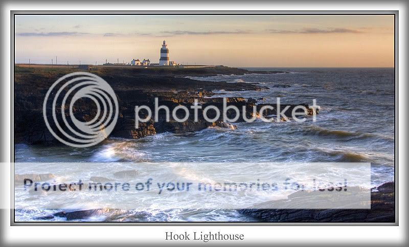
Hook Lighthouse
-
lousy
ParticipantNot so sure about the comp’ on this one, with the position of the l/house but I didn’t want to loose the surf at bottom LHS
Pat
sean1098
MemberI like it Pat,think the comp osition is good.IMO the surf makes the shot.
Sean.
Martin
ParticipantAnother very nice shot. Your developing a very good eye. The post processing and colours are super. I like the composition, would not change it think it works very well
M
Pixelle
MemberThe sun highlighting the rocks makes the shot for me. And the two translucent waves on the right [just above bottom rock] are well caught.
Brickee
Participantlousy
ParticipantThanks guys, I wasn’t exactly sure about the crop, but I feel better about it now
Patwexkel11
MemberPat, Our much photographed Hook Head. Excellant photo. But it’s the foreground that really works for me. Mike
mgst
Participantorla_f
Participantlousy
ParticipantIt’s a well photographed location, but to be honest the surf was what I was after and the lighthouse just an added attraction
Thanks again
Patossie13
ParticipantRob
MemberI’m going to be the odd man out here and say I think a crop
would improve this, purely from a compositional point of view.
For me, the lighthouse is too close to centre, even though the surf
is what it’s all about for you. I think if you crop away from the left
as far as that concrete structure, and from the bottom to lose that
rock on the bottom right, you’ll have a more balanced and pleasing
image overall. There again, it is a lovely shot in its own right…Rob.
You must be logged in to reply to this topic.


