Homepage › Forums › Photo Critique › Architecture / Urban Landscapes / Streetscapes › House Interior > Kitchen
- This topic is empty.
House Interior > Kitchen
-
aoluain
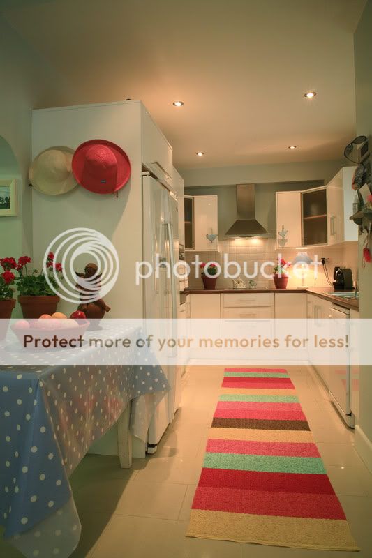
ParticipantI got a commission recently to photograph the interior of
a house with ajoining old fishing lodge.I wanted to capture the interior with the lights on to give a cosy feel
to it but also one of themain briefs was to bring the colour from the
mature gardens into the rooms as much as possible.So I kind of struggled with the mixed lighting . . . Particularly
the main kitchen work area was tricky.wha da ya think?
jb7
ParticipantWell Alan, they’re difficult spaces to be given…
I wanted to capture the interior with the lights on to give a cosy feel
to it but also one of themain briefs was to bring the colour from the
mature gardens into the rooms as much as possible.I’m not sure I know what you mean about bringing the colour in-
unless you might mean hanging the hats on the fridge,
and leaving the runner on the floor-Even if you are given a brief, it’s sometimes useful to take a better shot outside of it-
sometimes.There are a lot of things in the first shot that I wouldn’t be happy with-
well, pretty much everything, if I’m honest-
the wide angle pushes the kitchen very far back,
and allows in some of the clutter to the sides.The worktop is populated by random plants and a lamp and some cables-
all of which break the sweep, and adds more, well, clutter.That runner on the floor- if it was to be allowed to remain,
it perhaps should have been centered in the space, and straightened-Too much ceiling, a crop above the hats might help-
The swing on your perspective-
if the back wall had been parallel with your camera, it might have made for a more settled look,
and allowed the geometry of the room to follow more ordered lines-
it might have also needed a landscape orientation to make it work-
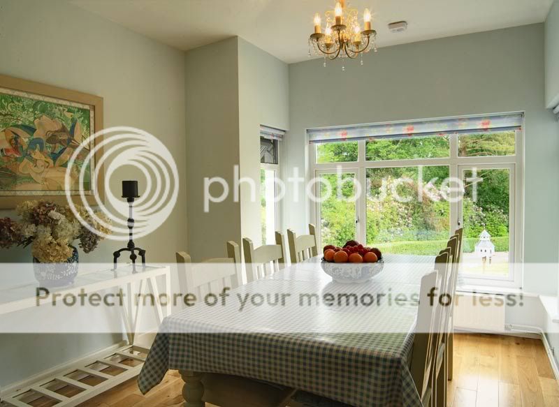
perhaps a square might have been the answer?The second shot, similar, but not as cluttered-
I might have considered putting the vase in the corner to hide those pipes,
but the group on the console works ok, apart from maybe the flowers breaking the line of the frame-White balance, especially in the first, might be a little warm-
I’d try playing with that, taking some of the red out of the whites-Sorry I can’t be more positive,
and all of this might sound like extreme nit picking…
which of course, it is.And there are different types of commission,
sometimes you can’t spend as much time on a shot as you’d like,
or perhaps the cost or final use doesn’t merit it-
but there are some easy things which make the picture better-
which usually means taking things out-joseph
Ashley
Participantaoluain wrote:
I got a commission recently to photograph the interior of
a house with ajoining old fishing lodge.Hi Alan
Who commissioned you ? – Architect, Builder, Estate Agent, Editor, Interior designer, Homeowner, etc.
Why do they need these images ? – To help sell the home or their thing, Show-of their product, etc..
What are they planning on using the images for ? – Magazines, Newspapers, Brochures, Web, etc.I really like the homeowner’s style and what they have done with the space – which your images clearly show.
Would like to see more of the home – did you shoot the rest of it ?aoluain
ParticipantThanks Guys,
Where do I start.
Joseph as always good indepth critique, most of whice I can relate to and have taken on board.
The kitchen is actually a very long and narrow affair and what you say about the counter tops
populated by random’s is correct, You would’nt see those potted plants normally there, knid of looks
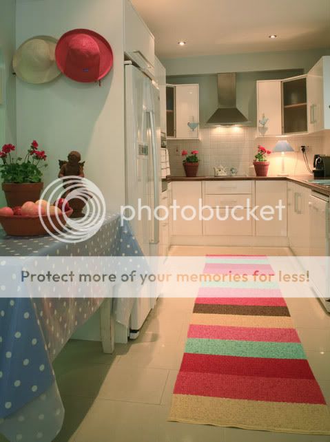
too staged.The kettle lead, yes didnt see that on the day. I would agree also with ceiling space and colour balance.
edited version below.The extra space and distractions to the left and right have also been amended.
The mat I made a point of straightening but with the wide angle it is distorted. I think I
used the Zeiss 24-85 for this one, have to check the exif.on the sceond image I used the shift system with 3 images stitched, I should have really
lost some of the space on the right and added it to the left to take in more of the painting etc.The brief was to capture the colour of the gardens and to make sure they were visible in the
images, my earlier comment was a bit misleading, sorry about that!Ashley, It was a private homeowner who commissioned the work. The kitchen above is in
the main house that they will be looking to rent out should anybody request it, at a premium
of course! There is also an ajoining fishing lodge which they are also looking to rent out.The interior indeed is of very good taste and well decorated. the owners are in a fortunate position
where if a potential client rings up or contacts them with a view to renting the lodge they can also
offer the main house [at a premium], drop tools and head off themselves for a week or two!The images are to be used initially for the web.
I think they thought we [myself and my brother] would be in and out in an hour, “snap, snap, snap
good luck” We were there for 5 hours [not getting paid enough for 5 hours onsite] but I wanted to
try and add these to a portfolio.Austin was shooting the gardins while I was shooting inside.
I will have more images of the interior later.
Again thanks lads.
Rob
MemberTricky enough kitchen to photograph I’d imagine, long narrow spaces
can be a pig sometimes…The colour balance, as mentioned previously by Joseph, hasn’t helped this
image at all, quite a pinkish cast to it. The clutter on the right too, definitely
worth cropping away completely. It does look as though there’s an arch of
some sort just behind the table with the pot plants which might have nicer
included in a wider shot taken with a step to your right…There are a lot of things that could be done here; sometimes, you need to
spend a little more time thinking about dressing the room, before you even
take your camera out of the bag. The client, just like their brief, is quite often
wrong about what may or may not work, and you as the photographer need
to convince them that you know better than they do. Away with the kettle
lead, away with that awful rug and its reflection off that cheap plastic table
cloth, etc…It can be useful to shoot tethered in situations like this, so you can see an
imediate result at a scale that allows you to have a more critical eye and
examine the flow of an image. Makes it a lot easier to convince your client too…5faythe
ParticipantHi Alan,
This has been an extremely interesting thread for me.
I have no experience of photographing interiors either as
a brief or for fun.When I viewed your images I formed an amateur opinion.
I liked the look of the images.I also thought they showed 2 nice rooms that might be pleasant to inhabit and
that the diningroom lead to what looked like a nice garden.In #1 I liked the hats but thought the extractor hood looked crooked and didn’t like
the plant pot and the picture being cut off on the LHS.In #2 I liked the way the image made the room look but again didn’t like the picture and
plant being cropped on the LHS.The images reminded me of images I have seen in interior magazines.
I then read the excellent and detailed critique supplied by our fellow members.
It was fascinating and educating to read.Well done to you all.
John.
Ashley
ParticipantRob wrote:
.. that cheap plastic table cloth…
Is probably a Cath Kidson oil cloth, so it may not be so cheap ;)
aoluain
ParticipantThanks Rob and John.
There was actually an interior designer on site too, sorry for got to mention that so I
didnt want to start throwing shapes around.
I think by the time I shot this the man of the house had enough and wanted us gone.I am annoyed that I didnt get all of that picture on the left in in the dining area also Rob.
And yes there was an arch there to the left in the kitchen but it was a bit untidy behind it.Ashley, Yes that table cloth was probably a quality item. No there wasnt much of a budget
as the budget also included the web-site design :cry: but it is experience I suppose.The colour cast is really annoying inthe kitchen I think that pinkish hue is from the bounce
back light from the rug . . .Anyway lads thanks for taking the time to comment, more to follow in a different thread.
Alan
Rob
MemberAshley wrote:
Rob wrote:
.. that cheap plastic table cloth…
Is probably a Cath Kidson oil cloth, so it may not be so cheap ;)
Plastic or oilcloth, it matters not. What matters to the client at the end of the
day is that the space is portrayed in its most complimentary light, and anything
that takes away from that is open to question. Expensive does not necessarily
equate with attractive – look at most Rolex watches – and if a £10 bedsheet from
Penny’s might look better than £40-50 worth of Cath Kidston oilcloth, I’d be
suggesting a quick trip upstairs to the bedroom for some props…Yes, the kitchen could have been lit better and it could have been styled better for the camera too. However, as it is only for web use, then Alan wouldn’t have had much of a budget – so I think he did a very good job here.
So do I Ashley. However, the images were posted in a critique forum and as
such were offered for critique. Had I posted them, I’d have been delighted with
the feedback I’d have given myself… ;)As for the.. Rob wrote:
..convince them that you know better than they do..
part. Be careful, as there is no faster way to offend a Homeowner, than to start moving their things or re-arranging things – which in your opinion aren’t right, without good reason.
Best to ask them first… especially if they are paying you.
Different story if you are paying them – but do be careful here, unless you really do know your stuff.In my limited experience, people hire photographers under the assumption that
you’ll know better than they do how to get the best picture possible, and as such are very
open and amenable to suggestions and explanations. If a misanthrope like me with
only average people skills can get a €750k mobile crane shifted 100 metres so it doesn’t
reflect in the glass facade of a building…Remember, there are knives in that kitchen… and that table cloth could be worth more than they are paying you :)
£50? Oh dear Ashley, this recession must have have hit your BURs something awful… ;)
Apologies Alan if I’ve gone a little off topic here…
aoluain
ParticipantAh no worries Rob !
“So do I Ashley. However, the images were posted in a critique forum and as
such were offered for critique. Had I posted them, I’d have been delighted with
the feedback I’d have given myself… Wink “:lol:
Still tricking around with the kitchen . . .
aoluain
ParticipantAshley
ParticipantRob wrote:
Plastic or oilcloth, it matters not. What matters to the client at the end of the
day is that the space is portrayed in its most complimentary light, and anything
that takes away from that is open to question.I except that.
However, that raises the big question of when does one stop and say:
“Wait a minute, that’s not what I’m be paid to do”.
“If they want things moved or changed, they should hire a Stylist or someone else”.Where does one draw the line, between what you are being asked to do and what they should be getting someone else to do ?
Are you really qualified to make the call anyway ?CianMcLiam
ParticipantColours in the last one are better but it seems to be missing that certain ‘pop’ of contrast and hence there’s a 3D quality missing to my eyes. I usually give my pics a quick shot of ‘auto-levels’ to see what a different distribution of tones looks like, even if I’m just going to undo it it often makes the original look like a haze and lets me know I need to work on the levels and curves to get more 3D action going on. Good work though given the space in there.
Did you bring along a grey card? If I could only bring three things to a indoor shoot in mixed lighting it would be camera, lens, grey card and maybe not in that order. Trying to pull the correct colours out of a hat after looking at the same image for a while can be seriously frustrating and above all makes the set inconsistent which makes them far less professional looking. I think warm areas in a scene like this would be ok but not a general cast over all the surfaces. You might get a good grey approximation from the brushed steel outlet on the back wall perhaps?
nfl-fan
ParticipantI’d be very sympathetic to the lighten… and those sleek lines bring back memories of 1987 in Birmingham.
Those polished porcelain tiles come from Right Price… €18 a square yard… way too cheap… nfl doesn’t do cheap… I’d have took them up and layed nicer ones… just for the sake of getting the photo the way I want it… and if the home owner had a problem with it… then tough sheet.
You know what they say in the industry… “once a cheap son of a beech, always a cheep son of a beech”. You don’t want everyone to think this about you… because it can become very hard to shake.
But then you have to ask yourself… “Who’s going to buy it?”… shortly followed by “What all will they want to use it for?”… because you know… one man’s sheet is another man’s champagne… n’ all that.
Ashley
Participantnfl-fan wrote:
You know what they say in the industry… “once a cheap son of a beech, always a cheep son of a beech”. You don’t want everyone to think this about you… because it can become very hard to shake.
But then you have to ask yourself… “Who’s going to buy it?”… shortly followed by “What all will they want to use it for?”
That actually sums it up very well… if you stop and think about it.
You are only as good as the weakest link… most of the time.
You must be logged in to reply to this topic.


