Homepage › Forums › Photo Critique › Landscape › Infrared Church and Graveyard Co Cavan
- This topic is empty.
Infrared Church and Graveyard Co Cavan
-
Martin
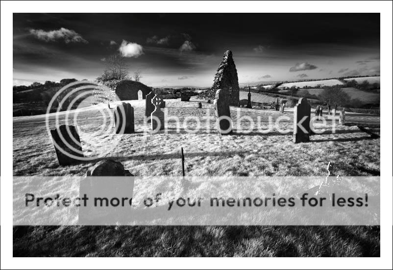
ParticipantWas in Co Cavan today looking around for shots and stumbled on the below. Don’t know the name of the area, if anyone knows let me know. Its between Knockbride and Glasleck west of Shercock Co Cavan
Let me know what you think of the below shots or suggestions for making any of them better
Cheers
MBig Fella
ParticipantGreat pics Martin, I love the second one, its got a great feel to it.
Stephen.
Tom
MemberAll of them are great Martin, #1 is my favourite, I love its composition. How to make them better? I don’t really know :wink:
randomway
MemberI love these Martin, the first two are my faves. One the last one all the lines are pointing at the right upper corner and I just prefer the compositions with the headstones tilting randomly to the left/right. I’m very envious seeing these photos and happy that you are posting them here for all to see. Nice work.
lousy
ParticipantAs stated before Martin, I am not a fan of the IR images, but once again I feel I have to eat my words.
These are excellent images, especially #1&2. .
Is this the result of an IR filter or is there more processing involved?
Patnfl-fan
ParticipantAll fine images… but #1 for me is a gem, the composition is superb. The two head stones in the foreground leading into the ruins are just perfect, loads of detail in them as well.
The manner in which all the stone features are swaying in different directions is also and nice feature here and adds to the image.
richiehatch
MemberWow.. stunning stuff Martin…! Like em all but especially the first…!
Richie
sean1098
MemberNice set Martin,the first is brilliant,followed by the third.Imo the second is the weakest of the three. It looks a bit soft on my screen.
Lovely shots.
Sean.
LWheeler
ParticipantNice set of photos. Especially like 1 and 3 as I feel that the composition is much stronger in them.
Makes me want to get out there to try out infra-red :-)
Lawrence
http://www.lawrencewheelerphotography.com
mgst
ParticipantBrickee
Participantquote=”Richie”[Wow.. stunning stuff Martin…! Like em all but especially the first…! ]
quote=”nfl-fan”[All fine images… but #1 for me is a gem, the composition is superb.]
They said it all.
Jim
ossie13
ParticipantMartin
ParticipantThanks for the comments guys. No 1 seems to be your favorite. I like this one the most myself followed by number 2. Think i need to reprocess no 3 to lighten it up a bit especially the foreground
lousyphoto: Is this the result of an IR filter or is there more processing involved?
Its a bit of both. The Image i get is half way there. After that i up the contrast in curves and dodge and burn the image to balance it up and darken it down a bit
Thanks again all
MAlan Rossiter
ParticipantIt’s number 2 for me Martin. The image seems to be well spaced out – the vertical format of the other 2 takes in too much sky in my opinion and condenses the points of interest. As good as the skies are I think there could be better days. But number 2 does it for me.
Alan.
Rob
MemberTim Burton would love these, as we all seem to. Number one for
most, number two for Alan, but number three for me. In saying that,
they’re all wonderful. Gorgeous work Martin…Rob.
You must be logged in to reply to this topic.


