Homepage › Forums › Photo Critique › People › Light table reshoot
- This topic is empty.
Light table reshoot
-
pete4130
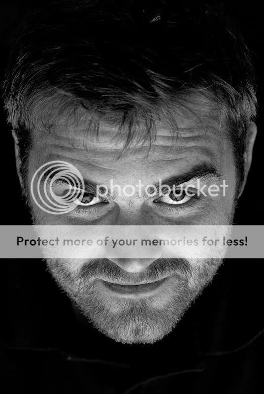
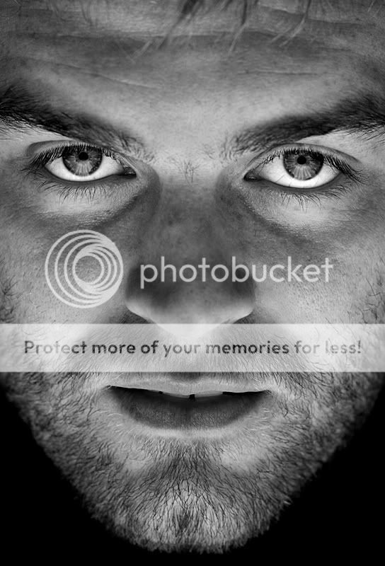
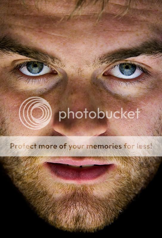
MemberSo, got my friend to remodel for me today. He was less eager than yesterday when I kept him there for more than 2 minutes but I got a few better shots (I think?). Here are 3 I like the best. I thought I’d deliberately overcook the colour version a little, it seemed to suit the image.
Again, any C&C welcome. Thanks.
sean1098
MemberNice set pete,like the mono’s better then the colour,and the third stands out for me,the detail in the eye’s is spot on imo.
Sean,
Conor
ParticipantHi Pete
Really like one and three. The black and white suit this better then the colour
Conor
VAubrey
MemberI like third photo. Amazing eyes!
First photo is interesting too.
B/w looks better but maybe change colour a bit only. Colour of his eyes is great too. I’d try to keep this colourconstantine
ParticipantI really like the mono conversions, you did an excellent job here, what lighting setup where you using here? I’d be very much interested in recreating the effect you achieved.
Ken
pete4130
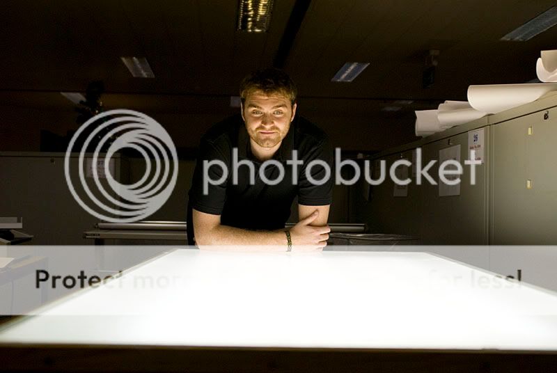
MemberThanks for the feedback. The set up I used was a light table in work ( I work with maps and drawings so a bright light table is needed for overlaying modern maps with maps from th 1800’s etc….). I used the light table to uplight his face and taped a sheet of white A3 card to either side of the light table to bounce some light from slightly in front of his face to reduce the shadows on his face. So no fancy lighting going on, just lucky enough to have a nicely diffused bright light to work with.
constantine
ParticipantCool.
Florescent tubes in that? Looks easy enough to throw one together.
lousy
ParticipantBig Fella
ParticipantHi Pete,
Number one for me. I much prefer the head shot only, I feel it works better, your naturally drawn to the eyes.
Fair play for spotting the opportunity for a picture in the first place.Stephen
Meo
ParticipantNo 1 is very good, it made me laugh because he has a very divilish look on his face and no 3 just plain scarey!
You must be logged in to reply to this topic.


