Homepage › Forums › Photo Critique › Landscape › Loughkip River
- This topic is empty.
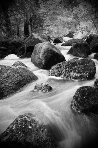
Loughkip River
-
seanmcfoto
MemberI’ve been very guilty of not posting my images anywhere for critique lately.
I guess it’s too easy to be precious about them, but of course, that closes off opinion and learning.
That said.. if you don’t like slow water shots (although this is *fast* water).. you won’t like this!seanmcfoto
MemberSo either it’s that bad that you don’t want to comment, or that good you’ve been rendered speechless…
richiehatch
MemberWell I like it…! The arrangement of the rocks seems quite well balanced. The
vignetting (whilst maybe a tad too strong) pulls you into the image almost
giving a 3D affect. Overall yeah i like it…!Richie
Alan Rossiter
ParticipantFirst time I’ve seen it so I can only comment when I do. I like it – I like the style of shot when external factors are added to emphasize the subject (vignette and B&W). I love the fact that the lighting looks uniform from foreground to background so the image flows as well as the water obviously does.
Alan
Martin
ParticipantI was speechless that’s why I didn’t reply, just got my voice back now:-)
I like this too
Composition is good, everything is arranged correctly
I like that its B&W, think it suits the picture
I like the vignetting also and think it addsOnly thing I might have done differently is to have lightened up the rocks in the middle of the stream a bit more. Think the blacks are too black, would allow some detail in the full blacks in the rocks. By doing this I think this would pull your eye more into the center of the picture to give it depth as thats the only thing i think that is missing
Over all a nice one
Mseanmcfoto
MemberAw. Thanks guys.
I do like this, but it’s old enough not to be precious.
Vignetting is always a tough one to get right IMHO, a hair this way or that can make a big differenceMartin,
I’ll give that a go. I assume you mean the shadow section of the centre rocks.Thanks again.
wesleylaw
MemberNice composition and depth. The main thing that occurs to me is whether it is flowing water or ice. There seem to be a bit to much texture. Either something got lost in the conversion or my monitor cant be trusted.
seanmcfoto
MemberHi Wesley,
the water is like a mini rapids and looks this way in colour. It’s a function of the shutter speed. If it looks like ice, even ‘cooler’.Martin
Participantseanmcfoto wrote:
Martin,
I’ll give that a go. I assume you mean the shadow section of the center rocks.Yes the rocks in the middle. Also lighten up the blacks on the rocks in the distance a little also and see what it looks like
Have fun
MMadeleineCalaidoWeber
Participantguilty or not….the image is great. i am sure there are more exciting details and sharpness in the original one than in this mini post. Like the vignet effect, it creates an artistical feeling…and that works everytime ( ;
Cheers Madeleine
You must be logged in to reply to this topic.


