Homepage › Forums › Photo Critique › Architecture / Urban Landscapes / Streetscapes › more electric mast
- This topic is empty.
more electric mast
-
Roberto
MemberI hate them in lanscapes but somehow started to like them alone…. :lol:
C&C welcome.flynny
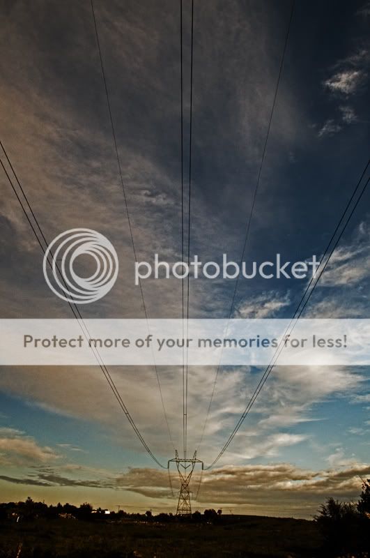
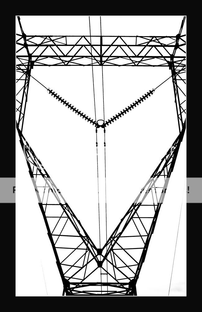
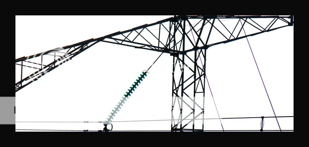
ParticipantThe second one for me Roberto, I like the symmetry, and the sillouette, look about it. The first is ok but its a bit “busy” at the bottom, the third is nice to, but I’d prefer No. 1.
Paul
mgst
ParticipantDeebo
ParticipantVery good Roberto. I quite like these structures too and I love the second shot, its really graphic and cool. Well spotted
Dee
Roberto
Memberaoluain
ParticipantI love the second two roberto,
would like to see more as a project from you, very graphic and abstract . . . go for it.I dont like the first one though, it is not as strong as the second two, and i dont like the
composition or the processing, without causing offense the first one is a nothing shot compared to
the others.go for more of these abstract shots !
Alan
Roberto
MemberThanks Alan for the comment.
I am thinking to do more of these type of shots.aoluain
ParticipantRoberto
Memberbremoran
ParticipantReally nice Roberto – I can see 2 and 3 as maybe posters or album covers – but they’d look great just printed too.
Roberto
Memberb318isp
ParticipantYou got the exposure on 2 and 3 spot on. There is no flaring and the contrast is really good – they are compositionally good to. The first isn’t a patch on there though.
Roberto
MemberThanks Brendan for the comments.
I don’t like the first now….. the post processing is not good!
You must be logged in to reply to this topic.


