Homepage › Forums › Photo Critique › Landscape › Mostly Old Stones
- This topic is empty.
Mostly Old Stones
-
CianMcLiam
ParticipantI’ve been working on a long term project over the last three years, concentrating on the pre-historic remains of stone age and bronze age Ireland, since I’m new here I thought I’d better share a wee bit of what I’ve been up to. Setting yourself a clearly focused project is probably the best way to improve your photography, it certainly has for me as I was a commited ‘point and shooter’ for many a year!
As I say, I’m new to this forum, so I hope this works…
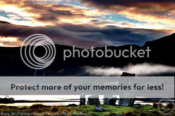
This is a small 5 stone circle (a very common form of stone circle in Cork/Kerry) with a massive outlying stone which almost leans over the ring like a protective parent and its children. There’s a lovely waterfall across the lake as well but its dependent on lots of rain. This was one RAW file converted twice for shadows and highlights. (D70 with 18-70mm lens I think, taken at dawn sometime around November 2005)Uragh Stone Circle, Co. Kerry.
jb7
ParticipantJust a couple of small points Ken, and only my own opinion, but I find that the sky dominates this image a lot. Perhaps it has been accentuated as a result of the HDR processing. I’ve had a look at this picture in letterbox format, without a sky at all, and it keeps my attention on the stones and the far waterfalls and the little pool of light across the lake.
You’ve positioned the big stone against the cloud, which gives it some much needed separation from the backround (at this resolution), and the lower stones are well separated by the lake, and the saturation in the foreground is pleasing, Perhaps there is some more detail in the mountains thats being obscured by your search for moodiness, as outlined in your introduction?
This is a complex picture passing itself off as a much simpler one, with pretty much all of it open to interpretation in processing. I think that it may be better not to overdo it, particularly the sky. I think I might consider reducing the saturation, a lot.Many people will disagree with this, like I said, its only my opinion.
But a tremendous first post nonetheless-
Not Pete the bloke
ParticipantYour photographic skills are obvious and therefore I know that what I see is deliberate on your part – but I would agree that the darkness of the mountains or mid-ground does create a strange feel to the image. It certainly has loads of impact and appeal!
As it is shot in RAW, I would process it again to bring out more detail from the shadow in the mid-ground and maybe darken the sky a bit for balance, to see whether it improves the image – but I suspect I am telling my granny to suck eggs?? :lol:CianMcLiam
ParticipantThanks both for the comments and criticisms, I do agree about the sky, I was using one ND grad (dastardly cokin with colour shifts) and ended up putting another in front of it because the sky was so bright and the valley so dark, except this one was upside down and the edge was halfway across the image there somewhere! Using two cokin grads into the light really screws up colour and the mountains opposite are dark because I couldn’t lighten them without showing the edge of the filter running across the frame. This was taken almost a year ago so I might try and process the RAW file again in Capture NX to see if I can improve as per the suggestions, it will still lokk a bit flat though because of the longer focal length and lack of detail in the background.
Roberto
MemberI like it.
It has a good dramatic atmosphere.
I would crop the bright part of the sky and keep the darker part.
You must be logged in to reply to this topic.


