Homepage › Forums › Photo Critique › Landscape › Mountain View
- This topic is empty.
Mountain View
-
Big Fella
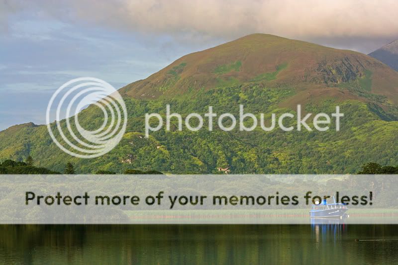
ParticipantHi all, this was taken about a week ago in Killarney. C&C as always welcome.
Stephen.
Seaview
ParticipantVery nice Stephen, the colours are great but I think they might be a bit saturated for some peoples taste. If you don’t have a wide lens you should certainly invest as it would look super a slightly wider, or you could try to stitch a few together.
Dave
Alan Rossiter
ParticipantI like this one Stephen. I agree the saturation is a little storng but I can see colours like that at sunset so you’d live with it. A little more contrast on the background mountain may help but only you know what’s best there.
Alan
Bricker
ParticipantNice, in a way it looks like two different photos if you know what I mean…..
Big Fella
ParticipantThanks for the feedback all.
Dave – I think I took this at 70mm or there about, I can go to 18mm but then I would have had a load of lake in the foreground with nothing in it really. I would agree wider would be better if there was foreground interest.
Alan – I was a bit heavy handed with the saturation alright. I tried to darken the mountain in PS but it did’nt look natural.
Des – I know what you mean, the mountain is a lot further away that in the image where it looks as though its just at the back of those trees, hence the lighter colours.
Stephen.
slideordie
MemberLove the contrast of the blue boat against the background. Nicely processed, only thing I would personally add would be a drab of sharpening, particularly with the boat.
Nice image tho :)
Big Fella
ParticipantThanks slideordie, I viewed this today on another PC and felt it was a different image to that I posted. Definately over saturated. It looks a way better in my own machine. Currently trying to sort out my monitor.
Stephen.
slideordie
MemberSaturation looks just fine on my monitor, tho I do prefer the saturated look.
Jody
ParticipantI agree that the saturation is a little too strong, however I wouldn’t like to see you lose the effect you’re having with the blue boat standing out against the greenery.
Big Fella
Participant
You must be logged in to reply to this topic.


