Homepage › Forums › Photo Critique › Catch All › Travel › Munich 1
- This topic is empty.
Munich 1
-
Deebo
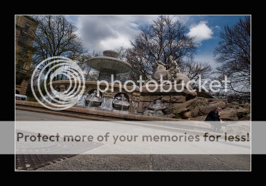
ParticipantIts a nice scene but not keen on the angle. A quick rotate would help, bu ti do like the low perspective the shot adds
Dee
Roberto
MemberThanks Deebo for the comment.
I did some changes, crop and light adjustment of it and maybe the angle will make sense … now…?irishshagua
ParticipantThink I’d prefer the first one Roberto. I’d agree with Deebo that the low angle for the shot is definitely interesting. The shore is a bit ugly in the picture IMO unfortunately and I’m not mad at all about the frame in the second shot but I like the first one (minus the shore :wink:)
Brian
Roberto
MemberThanks Brian for the comment.
I use the frames on websites just to try to ‘bring up’ a photo. Wouldn’t use for print.If I understund correctly you mean under shore the angle….? Sorry for my English!
I don’t know… but some pics realy need different angle. I don’t want take only tourist photos!
I just wanted to show the man who needs some relax because he is down or maybe stressed….? … and this is why I used the angle shot…
is it make sense?irishshagua
ParticipantNo I think you misunderstood me Roberto. I do like the angle. What I was saying was that, I find the shore (or manhole) in the bottom left of the picture a bit ugly and not sitting well in the image. I do like the angle of the shot though and I prefer the processing on the first shot.
:D
BrianRoberto
MemberThanks Brian! … now I understund what do you mean…. I hope .. :-)
I don’t have any problem with that peace of metal… because it’s part of the area…
the photo is under Travel section and I don’t think it will be right to just crop it….would you change it? and how?
irishshagua
ParticipantI know what you mean. I wouldn’t like to clone out something so prevalent in apicture either. I just think that maybe there was angle for the shot that may have excluded the shore. Only a minor gripe though… :wink:
Brian
Roberto
Memberthanks a lot Brian for the respond and your time!
the pic was taking with 17mm lens…
I could do it without the ‘shore’ but would loose some part of the fountain…. specially with the low angle
I could do it with normal ‘eye hight’….
would be worth it?
not for me….Cota
ParticipantI think the angle works beautifully because the statues pedestal is straight and balances the shot.
Rob
MemberDefinitely prefer the light in your original post. I think the edit
looks a little soft and the separation of highlights and shadows
gets a bit lost. Love the angle you’ve used…Rob.
Expresbro
ParticipantFirst one for me too Roberto. I like the way you have placed the man in the frame..almost at the edge…because he does indeed look worried or stressed.
Without him it would just be a nice shot of a fountain. He creates a story in the shot I think.
Roberto
MemberThanks for the comments!
I have to do something with the bus on the middle of the left side…… it’s distructing…..
You must be logged in to reply to this topic.


